The Application window is the central workspace in Earth Volumetric Studio for creating and managing your data processing and visualization workflows. It provides a visual, node-based environment where you build networks by placing and connecting modules to define a data flow.
The window is divided into two main sections: the Module Library on the left and the Application Network on the right.
Module Library
The Module Library contains a comprehensive list of all available modules, organized into categories such as Estimation, Geology, and Annotations. To build your application, you can find the desired module in the library and drag it onto the Application Network canvas.
This topic is discussed in more detail in the Module Library topic.
Application Network
The Application Network is the gridded canvas where you assemble your workflow. Modules are placed here and connected to one another to control the flow of data. Each module has input and output ports, and you create connections between matching ports on different modules. This visual representation allows you to easily understand and modify the data processing pipeline. The style of the connections (curved, straight) can be controlled in the Application Options.
A toolbar at the top of the Application window provides quick access to various tools and settings for managing your application.
Tool
Icon
Description
Show Module Library
Toggles the visibility of the Module Library panel on the left.
Edit Application Properties
Opens the Application Properties in the Properties window. These properties are global settings that apply to the entire application, such as Bookmarks and Colors.
Edit Application Favorites
Opens the Application Favorites in the Properties window. This panel contains a collection of all module properties that you have manually marked as favorites, providing quick access to them.
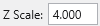
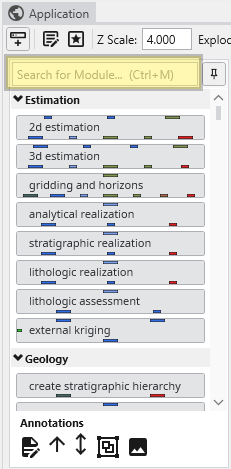
Z Scale
Controls the global vertical exaggeration for all viewers in the application.
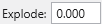
Explode
Controls the global explode factor, which separates objects in the viewer for better visibility.
Create Snapshot
Saves a snapshot image of the current state of the Application Network.
Bookmarks
A dropdown menu that allows you to quickly toggle between saved bookmarks, which store specific camera views and other scene settings.
Provides controls to manage the zoom level of the Application Network. You can zoom in or out, reset the zoom to its default level, or automatically adjust the zoom to fit the entire network within the view.
Application Overview
Shows a stylized, high-level overview of your Application Network, which is useful for navigating large and complex applications. You can click on that overview to zoom in on that part in the Application Network.
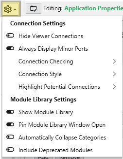
Options Menu
The Options menu contains settings related to connections and the Module Library.
Connection Settings
Hide Viewer Connections: Toggles the visibility of connection lines leading to any viewer modules.
Always Display Minor Ports: When enabled, all module ports (both major and minor) are displayed. When disabled, only major ports are shown by default.
Connection Checking: Submenu for settings related to data type validation when connecting modules.
Connection Style: Submenu to change the appearance of connection lines (e.g., curved or straight).
Highlight Potential Connections: Submenu to control which ports a connection can connect to when you are creating a new connection.
Module Library Settings
Show Module Library: Toggles the visibility of the Module Library.
Pin Module Library Window Open: Keeps the Module Library panel open and prevents it from automatically collapsing.
Automatically Collapse Categories: If enabled, module categories are collapsed by default.
Include Deprecated Modules: Toggles the visibility of older, outdated modules in the Module Library.
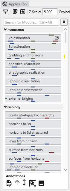
The Module Library is a core component of the Application window, serving as the repository for all modules used to build data processing and visualization workflows. It is located on the left side of the Application window and a fixed part of it. Unlike most other windows, it cannot be undocked, but it can be hidden when not in use.
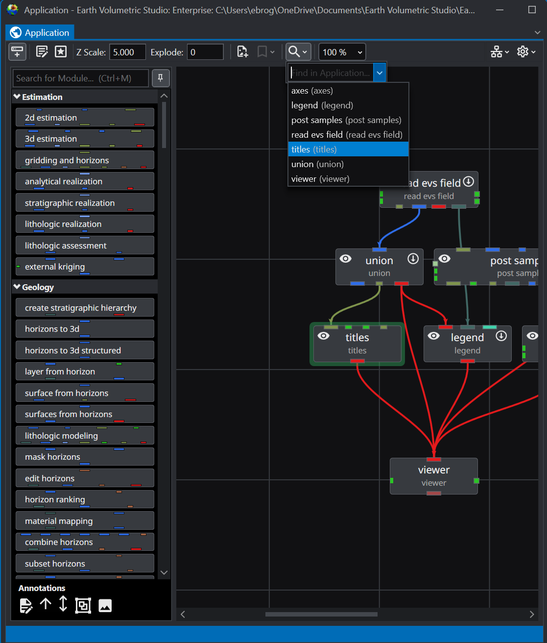
Finding Modules in the Application Network For large or complex application networks, the search functionality provides an efficient way to locate specific modules. The search tool is located in the toolbar at the top of the Application window.
Using the Search Tool The appearance of the search tool depends on the available width of the Application window. In narrower views, it may appear as a magnifying glass icon. In wider views, it will be displayed as a full search box labeled “Search for Module in Application”.
Subsections of Application
The Module Library is a core component of the Application window, serving as the repository for all modules used to build data processing and visualization workflows. It is located on the left side of the Application window and a fixed part of it. Unlike most other windows, it cannot be undocked, but it can be hidden when not in use.
Modules are organized into collapsible categories, such as Estimation and Geology, allowing you to easily browse and find the tools you need. You can control whether these categories are expanded or collapsed by default in the Options menu of the Application window. To add a module to your workflow, simply drag it from the library and drop it onto the Application Network canvas. Alternatively, double clicking a module will also create a new instance on the Application Network.
At the top of the Module Library, you will find controls for searching and docking.
The Search bar allows you to quickly filter the list of modules. As you type, the library will display only those modules whose names match your search query. You can also use the keyboard shortcut Ctrl+M to focus on the search bar, even if the Module Library is unpinned and closed.
Next to the search bar is the Pin button. This button controls the auto-hide behavior of the Module Library. When the library is pinned, it remains permanently visible. If you unpin it, the library will automatically slide away when not in use and can be reopened by clicking the Show Module Library button in the Application window’s toolbar or via the keyboard shortcut Ctrl+M.
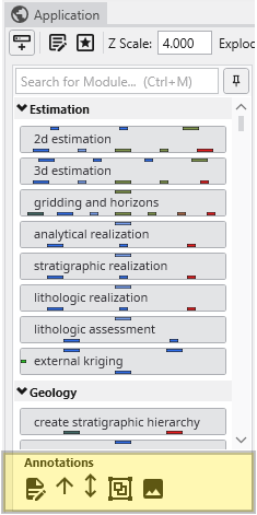
Annotations
At the bottom of the Module Library is a set of tools for adding visual annotations to your Application Network. These elements help document your workflow, clarify connections, and organize complex applications. Clicking on an annotation shows contextual menu items such as Delete, Copy, Paste and a coloring option.
Annotation
Description
Text Annotation
Adds a text box directly onto the Application Network canvas. You can use it to add notes, titles, or descriptions for different parts of your workflow.
Line Annotations
There are two types of line annotations for drawing arrows on the canvas. These are useful for pointing to specific modules or visually grouping related items that may not be physically close to each other.
Group Annotation
Creates a visual container for a set of modules. You can drag modules inside a group annotation to organize them as a logical unit. The group can be named, resized, and collapsed, which can be useful for simplifying the view of a large Application Network. When you collapse a group, it is displayed as a single item, and all connections to the modules it contains are shown connecting to the group instead.
Image Annotation
Places an image from a file directly onto the Application Network canvas. This can be used for adding logos, diagrams, or other visual aids to your workflow documentation.
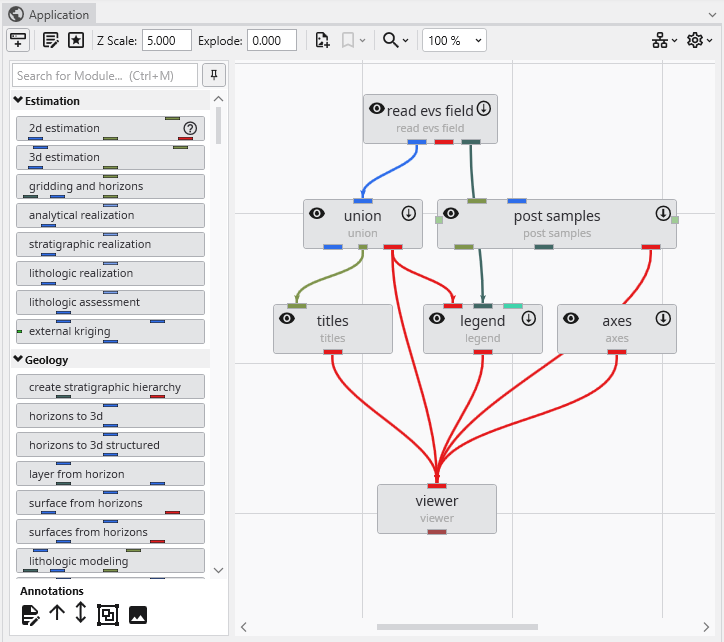
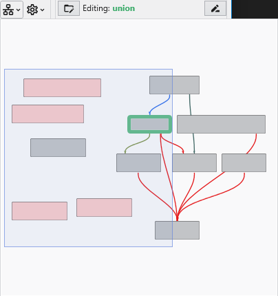
The Application Network is the primary workspace in Earth Volumetric Studio for building and managing your data processing workflows. It is a visual, node-based environment where you construct “applications” by placing modules and connecting them to define a data flow from input to final visualization.
Modules
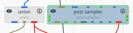
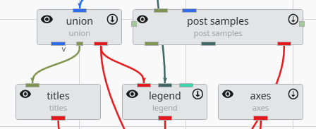
Modules are the fundamental building blocks of an application. Each module performs a specific task, such as reading data, performing a calculation, creating a geometric object, or rendering a scene. They are represented by rectangles on the Application Network, each stating a user-defined name and the module type under it. You add modules to your network by dragging them from the Module Library onto the Application Network canvas.
Each module has a set of icons that appear when you hover over it, providing quick access to key functions:
Icon
Description
Disable/Enable Module
Clicking this icon disables the module and any downstream modules that depend on it. A disabled module will not execute when the application is run. The icon appearance will change to quickly notice disabled modules. Clicking the icon again re-enables it and will make it run immediately.
Hide/Show Output
This icon is available on modules that produce a visual output. Clicking the eye icon toggles the visibility of that module’s output in all viewers.
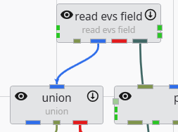
Modules communicate with each other through ports. Each module has one or more input ports (on the top) and output ports (on the bottom). You create Connections between modules which define the top-down Data Flow of the application, directing the output of one module to become the input for the next. See the Connecting and Disconnecting Modules topic.
Ports are color-coded to indicate the type of data they handle, and you can only connect ports of a similar color. While there are many port types, the two most critical and frequently used are Field ports and Renderable Object ports.
Connections can be removed by selecting the connection with the left mouse button in the Application Network and then either using the DEL key or by clicking the right mouse button and choosing the Disconnect option.
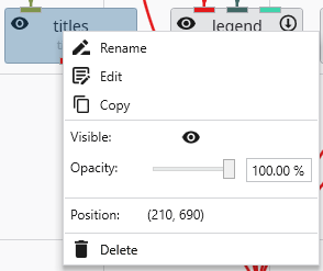
Module Right-Click Menu
Right-clicking on any module in the Application Network opens a context menu that provides quick access to several common actions and properties for that module.
Option
Description
Rename
Allows you to change the display name of the module as it appears on the Application Network canvas.
Edit
Opens the selected module’s parameters in the Properties window.
Copy
Creates a duplicate of the selected module, including its current settings. The new module can be pasted with CTRL+V.
Visible
This toggle, represented by an eye icon, controls the visibility of the module’s output in the viewer (applies only to modules with a red output port).
Opacity
This slider and input box allow you to adjust the transparency of the module’s visual output in the viewer.
Position
Displays the read-only X and Y coordinates of the module’s top-left corner on the Application Network canvas.
Delete
Removes the module and all of its connections from the Application Network.
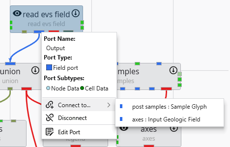
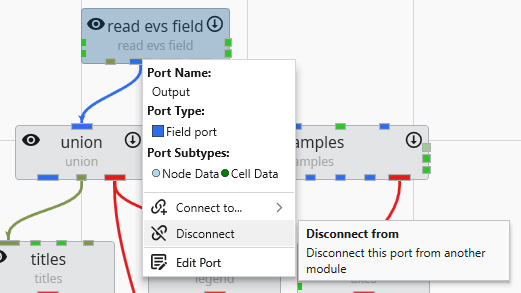
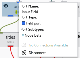
Input Port Context Menu
Right-clicking on a module’s input port opens a context menu providing details and actions for the incoming connection.
Option
Description
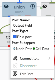
Port Name
Displays the name of the port.
Port Type
Shows the type of data the port accepts, indicated by a colored icon and a description.
Port Subtypes
Lists the specific kinds of data this port requires the output port to provide.
No Connections Available / Connect from…
Indicates if compatible output ports are available. If so, it allows you to create a connection.
Modules in the Application Network feature a set of icons directly on their surface that provide at-a-glance information and quick control over their execution and visibility. Modules that can be executed or produce a visible output have icons on their left and right sides. The right-side icon controls execution, while the left-side icon controls visibility in the viewer.
Modules in the Application Network display several visual cues to indicate their current status. These indicators help you quickly understand which module is selected, which is being edited, whether a module has run successfully, and if it is set to execute automatically. This allows for efficient management of your application’s workflow.
Selection and Editing Status The border of a module changes color to reflect its selection and editing state.
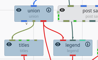
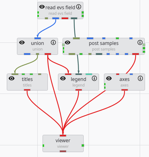
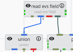
Modules in the Application Network are linked together by connections, which represent the flow of data from an output port of one module to an input port of another. Creating and removing these connections is fundamental to building and modifying your application’s workflow. The system helps ensure that you only make valid connections between compatible port types.
The color of the ports on a module provides an immediate visual cue about the type of data they accept or output. Understanding these colors and types helps in quickly assessing a module’s function and ensuring you are making valid connections within the Application Network.
Port Types Each port type is designed to handle a specific kind of data. The primary types are listed below.
Subsections of Application Network
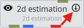
Modules in the Application Network feature a set of icons directly on their surface that provide at-a-glance information and quick control over their execution and visibility. Modules that can be executed or produce a visible output have icons on their left and right sides. The right-side icon controls execution, while the left-side icon controls visibility in the viewer.
Execution Control
The icon on the right side of a module indicates its execution status. Clicking this icon toggles the module’s Run property, which is the same setting found in the Module Properties window.
State
Icon
Description
Run
The downward-pointing arrow signifies that the module is active. It will execute automatically whenever its properties change or when it receives new data from an upstream module.
Off
The pause symbol indicates that the module’s automatic execution is turned off. It will not run until it is manually triggered through the Run Once button in its Module Properties window or its status is toggled back to Run.
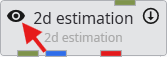
Visibility Control
The icon on the left side of a module controls the visibility of its output in the 3D viewer. Clicking this icon cycles through the available visibility states, which is the same as the visibility icon in the Table of Content in the Viewer.
State
Icon
Description
Visible
The open eye indicates that the module’s output is currently visible in the viewer.
Hidden
The crossed-out eye indicates that the module’s output is hidden in the viewer.
Excluded
This special state also hides the output in the main EVS viewer. More importantly, it completely excludes the object from being exported to web formats (CTWS) or 3D PDFs.
Locked
This state ensures the module’s output is always visible. It is primarily used for web exports (CTWS), where it forces the object to be visible, overriding any user attempts to hide it.
Special Visibility States for Parent Modules
Modules that can have multiple renderable children connected to them (such as group_objects or sequence modules) can display combined visibility states if their children have different settings.
State
Icon
Description
Indeterminate
Shown when some connected children are Visible and others are Hidden.
Visible with Excluded Child
Shown when the parent is set to Visible, but at least one child is Excluded.
Hidden with Locked Child
Shown when the parent is set to Hidden, but at least one child is Locked.
Modules in the Application Network display several visual cues to indicate their current status. These indicators help you quickly understand which module is selected, which is being edited, whether a module has run successfully, and if it is set to execute automatically. This allows for efficient management of your application’s workflow.
Selection and Editing Status
The border of a module changes color to reflect its selection and editing state.
Status
Description
Selected Module (Darker Background)
When you single-click a module, it becomes selected, indicated by a darker background. You can select multiple modules at once (e.g., by holding Ctrl or Shift), and all will show this background.
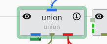
Editable Module (Green Border)
When you double-click a module, it becomes the single “editable” module, and its properties are displayed in the Properties window. This state is indicated by a thick green border. There can only be one editable module at a time.
Editable Port
If you double-click on a specific output port of a module, that port’s properties will be shown in the Properties window. The parent module will receive the green “editable” border to indicate it is the focus of the properties window.
Output Status
A key indicator of a module’s state is the presence or absence of a solid red bar along its bottom edge. This simple visual cue instantly tells you whether a module has successfully run and produced data that is available to downstream modules.
Status
Description
No Output (Red Bar Visible)
When a module displays a prominent red bar, it signifies a “No Output” state. This occurs if the module has not yet been executed or if it failed to generate any valid output. The red bar serves as a clear warning that downstream modules will not receive any data.
Has Output (No Red Bar)
When the red bar is absent, it indicates a “Has Output” state. This confirms that the module has run successfully and its output data is ready and available for downstream modules.
Status in the Application Overview
The Application Overview window also provides a simplified summary of module statuses, which is useful for monitoring complex applications. In the overview, you can still see which module is selected for editing (highlighted in green) and which modules have successfully run (those without the red “No Output” bar).
Modules in the Application Network are linked together by connections, which represent the flow of data from an output port of one module to an input port of another. Creating and removing these connections is fundamental to building and modifying your application’s workflow. The system helps ensure that you only make valid connections between compatible port types.
Creating Connections
There are two primary methods for connecting modules: dragging with the mouse or using the right-click context menu.
Method 1: Drag and Drop
This is the most common and intuitive way to connect modules.
In the Application Network, locate the output port on the source module that you wish to connect from.
Press and hold the left mouse button on the output port and begin dragging your cursor away from it. A line will appear and follow your cursor, originating from the port.
Drag the cursor towards the target module. While you keep the left mouse button down, all compatible input ports will be highlighted, indicating where a valid connection can be made. Incompatible ports will remain un-highlighted. This guidance behavior can be controlled in the Options page in the Menu.
Release the mouse button over one of the highlighted, compatible input ports. The connection will be established, and a solid line will now link the two ports.
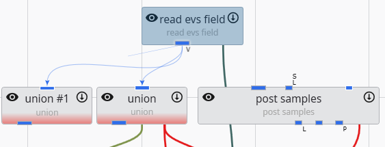
Method 2: Using the Context Menu
This method is particularly useful in complex applications where modules are far apart, making dragging impractical.
Move your cursor over the desired port (input or output) on the source module.
Click the right mouse button to open the port’s context menu.
Select the Connect to… option. This will typically open a sub-menu or a dialog window that lists all compatible ports available in the entire application.
Choose the target module and port from the list. The connection will be created automatically.
Removing Connections
You can remove existing connections using either a keyboard shortcut or the right-click context menu.
Method 1: Using the Delete Key
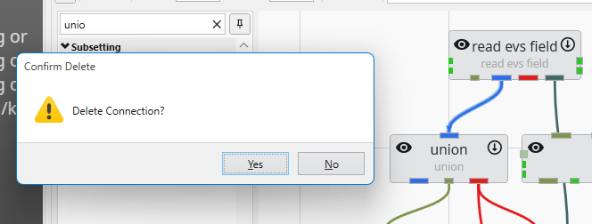
Move your cursor over the connection line you wish to remove. The line will highlight to indicate it is interactive.
Click the connection with the left mouse button to select it. A selected connection is typically indicated by a change in its appearance, such as becoming thicker or changing to a dashed line.
With the connection selected, press the Delete key on your keyboard. The connection will be removed if you confirm the warning that will pop up.
Method 2: Using the Context Menu
Move your cursor directly over the connection line you wish to remove.
Click the right mouse button to open the context menu for that connection.
Select the Disconnect option from the menu. The connection will be removed immediately.
Once a connection is removed, the flow of data between the two modules is stopped. The downstream module will no longer receive updates from the upstream module and may enter a “No Output” state (indicated by a red bar) if it no longer has a valid data source. See Module Status Indicators.
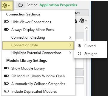
Connection Style
The Application Network provides flexibility in how the connections between modules are displayed. You can customize the visual style of these connections, choosing between direct, straight lines or smooth, curved lines. This setting allows you to tailor the appearance of your workspace for optimal clarity, which can be particularly helpful when working with complex applications where numerous connections might overlap.
Curved Connections:
Straight Connections:
The color of the ports on a module provides an immediate visual cue about the type of data they accept or output. Understanding these colors and types helps in quickly assessing a module’s function and ensuring you are making valid connections within the Application Network.
Port Types
Each port type is designed to handle a specific kind of data. The primary types are listed below.
Port Type
Color Name
Color
Description
Renderable Object
Red
This port handles renderable geometry and connects to the Viewer to display objects like isosurfaces, axes, or legends. It contains the fields, data, and rendering information necessary for visualization.
Field
Blue
This is the most common port type, used to pass datasets - such as grids with nodal or cell data - between the modules that create, subset, or modify them.
Realization Field
Light Blue
This is a special variant of the Field port used in stochastic modeling workflows to pass data for geostatistical realizations.
String
Olive Green
This port is used to pass text data, which can range from single words and phrases to full file names and paths.
Geologic Legend Information
Dark Green
This data port contains material names and related information from geology modules, often used to populate legends.
Vistas Data
Brown
This port is specifically used to pass geologic surface information to Groundwater Vistas for initializing MODFLOW models.
Number
Green
This port passes a single real number between modules.
Date-Time
Yellowish Green
This port passes date and time information.
View
Light Maroon
This port is an output from the viewer that passes the entire scene’s information, used by modules that export the viewer contents.
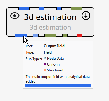
Port Subtypes
In addition to the primary colors, some ports feature one or more small colored dots. These dots indicate port subtypes, which provide more specific information about the data and enforce stricter connection rules. A connection is only valid if the output port includes all subtypes on the input port. This system prevents invalid connections, such as connecting a module that expects cell-based data to a port that only provides node-based data.
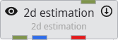
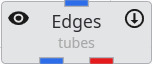
Below is an example of the output port for the 3d estimation module, which has three subtypes: Node Data, Uniform, and Structured.
The subtypes are grouped by their primary port category:
Category
Subtype
Color
Description
Field Subtypes
These subtypes describe the structure of the grid or the nature of the data within a Field object.
Geology
Goldenrod
Indicates that the field contains data representing geologic materials or stratigraphy, typically as integer material IDs.
Structured
Light Salmon
Indicates that the field is a structured grid, where the grid points are arranged in a regular, logical pattern (i.e., an i, j, k lattice).
Uniform
Purple
A more specific version of a structured grid, indicating that the spacing between grid points is constant along each axis.
Node Data
Light Blue
Indicates that the data values in the field are associated with the nodes (vertices) of the grid.
Cell Data
Green
Indicates that the data values in the field are associated with the cells of the grid.
Number Subtypes
These subtypes specify the intended use for a numeric value that is passed between modules.
Z Scale
Pink
Represents a numeric factor for vertical exaggeration, used to stretch or compress the Z-axis in the 3D viewer.
Explode
Gold
Represents a numeric factor that controls the “explode” distance, which separates components of a model for better visibility.
String Subtypes
These subtypes specify that the string data represents a path to a particular kind of file.
Filename
Blue
A generic file path.
Analytical File
Green Yellow
A path to a file containing analytical chemistry data.
Stratigraphy File
Light Goldenrod Yellow
A path to a file defining stratigraphic layers or surfaces.
Lithology File
Dark Gray
A path to a file defining lithologic materials and their properties.
Identifying Ports
To identify which port on a module corresponds to a specific item in the documentation, follow this order:
Input Ports are read from top to bottom on the left side of the module, then left to right on the top side.
Output Ports are read from top to bottom on the right side of the module, then left to right on the bottom side.
You can also hover your cursor over any port to see a tooltip with its name and data type details.
Finding Modules in the Application Network
For large or complex application networks, the search functionality provides an efficient way to locate specific modules. The search tool is located in the toolbar at the top of the Application window.
Using the Search Tool
The appearance of the search tool depends on the available width of the Application window. In narrower views, it may appear as a magnifying glass icon. In wider views, it will be displayed as a full search box labeled “Search for Module in Application”.
To use the search, you can either begin typing the name of the module you wish to find or click on the search box (or icon). Clicking will reveal a dropdown list containing all modules currently in the Application Network. Selecting a module from this list will immediately locate it.
Search Results
When you select a module from the search results, two actions occur simultaneously in the user interface:
The Application Network view will automatically pan and zoom to center on the selected module, which will be highlighted with a green outline for easy identification.
The **Properties**window will update to display the parameters for the selected module. This allows for immediate access to view or edit the module’s settings without needing to manually select it in the network.
This integrated functionality streamlines the process of navigating and editing complex workflows, making it easy to manage even the most extensive application networks.


