Introduction to Datamaps
In the fields of scientific and geometric visualization, a datamap is a fundamental concept that serves as the bridge between raw numerical data and its visual representation. At its core, a datamap is a function or a lookup table that translates data values into visual properties, most commonly color. Think of it as a sophisticated legend that instructs the rendering engine how to “paint” the data onto a geometric object, such as a surface, a volume, or a set of points.
Every value in your dataset, whether it represents temperature, contaminant concentration, pressure, or a geologic material type, is assigned a color based on the rules defined in the datamap. This transformation is what turns an abstract collection of numbers into an intuitive and immediately understandable visual model. Without datamaps, a 3D model of contaminant distribution would be a colorless, featureless shape, providing no insight into where the highest concentrations are or how they vary in space. The datamap is what brings the data to life, allowing us to see the patterns, trends, and anomalies that would otherwise be hidden in spreadsheets and data files.
The Purpose of Datamaps in EVS
In Earth Volumetric Studio, datamaps are the primary tool for communicating the meaning of your data within a visual context. Their purpose extends beyond simply making things colorful; they are a critical component of data analysis and presentation for several key reasons.
First, they make complex data interpretable. A bright red area in a plume model is instantly recognizable as a “hotspot” of high concentration, while a transition from green to blue can clearly show the gradient where values are decreasing.
Second, they provide a quantitative reference. A well-designed datamap, coupled with a legend, ensures that the visualization is not just a pretty picture but a scientifically accurate representation. Each color corresponds to a specific data value or range, allowing a viewer to probe any point on a model and understand its precise quantitative meaning.
Finally, they are essential for highlighting features of interest. Data in environmental and geological sciences often spans many orders of magnitude. A datamap can be carefully designed to focus the visual contrast on the most critical parts of the data range, making subtle but important variations stand out while de-emphasizing less relevant data.
Types of Data and Datamap Processing
Datamaps in EVS are highly flexible and can be configured to handle different types of data and distributions. The way a datamap translates values to color can be linear, non-linear, or categorical.
Linear Datamaps
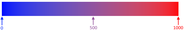
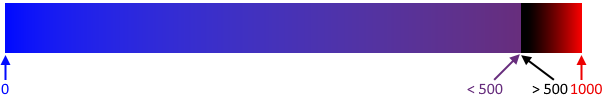
A linear datamap applies a smooth, uniform color gradient across the entire range of the data. The relationship between a data value and its position in the color gradient is a straight line. For example, in a dataset ranging from 0 to 1000, a value of 500 would be mapped to the exact middle of the color ramp. This type of mapping is best suited for data that is evenly distributed and where the importance of changes is consistent across the entire range, such as a simple temperature scale.
Non-Linear Datamaps
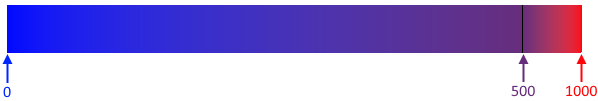
A non-linear datamap is used when the data is not uniformly distributed or when certain ranges are more important than others. In this case, the relationship between data values and colors is not a straight line. This allows you to allocate more “color space” to the most critical parts of your data range.
A classic example is contaminant concentration data, which might range from 0.01 to 10,000. If a linear datamap were used, most of the color gradient would be dedicated to the high-end values, making it impossible to distinguish between low-level concentrations (e.g., 0.1 vs. 1.0), which might be the most critical range for regulatory purposes. A non-linear datamap can be configured to stretch the color gradient across the lower values, providing high visual contrast where it is needed most.
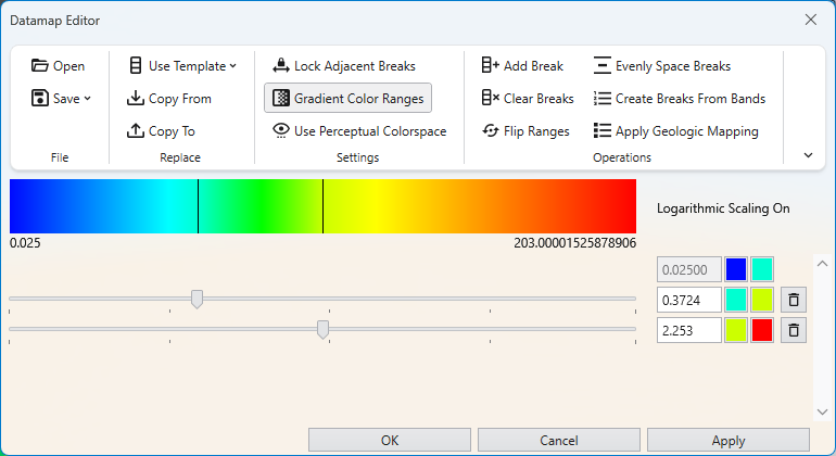
The colors of breaks on both sides don’t have to be continuous. If the Lock Adjacent Breaks toggle in the Datamap Editor is disabled, you can choose both colors separately.
 A note on precision: Due to the nature of precision in floating-point calculations, a value that is identical to a break point can be categorized into either the adjacent upper or lower interval. If you need to ensure a specific value is colored correctly, we recommend slightly shifting the break point. For example, changing a break from 500.0 to 500.0001 ensures the value 500.0 falls into the lower interval.
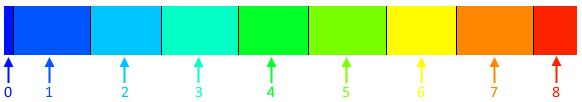
Categorical Data
Datamaps are also used for categorical data, which is qualitative rather than quantitative. Examples include geologic material types (“Sand”, “Clay”, “Gravel”), land-use classifications, or sample location IDs. For this type of data, the datamap assigns a single, discrete color to each unique category. There is no gradient or blending between colors. In EVS, this is typically handled by assigning an integer ID to each category (e.g., Sand=1, Clay=2). The datamap is then configured with distinct colors for each integer value, effectively creating a color key for your categorical data.
Logarithmic Processing
Logarithmic processing is a specific type of non-linear mapping designed for data that spans several orders of magnitude. By taking the logarithm of the data values before mapping them to color, vast ranges are compressed into a more manageable scale. This makes logarithmic datamaps the standard and most effective way to visualize data like hydraulic conductivity or contaminant concentrations. EVS handles this transformation automatically when the log processing option is selected in many modules, so you do not need to manually convert your data. The datamap works with the log-transformed values, but associated legends will still display the original, human-readable values.
The Datamap Editor is the primary tool in Earth Volumetric Studio for creating and customizing the mapping between your data values and the colors used to represent them in a visualization. It provides a powerful, interactive interface to control color gradients, data ranges, and scaling, allowing you to effectively highlight the features of interest in your data.