The Application Colors feature provides a centralized way to manage a consistent color palette across your entire application. By setting a few base colors, you can ensure that various annotation modules - such as titles, legends, and axes - as well as the viewer background all share a coordinated and professional look.
This feature is particularly powerful when used with linked properties, as it allows you to switch between entire color themes (e.g., from a light to a dark theme) with a single click.
Accessing Application Colors
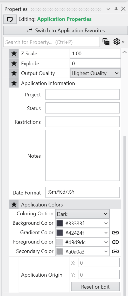
The Application Colors settings are located in the **Application Properties**application-properties.md panel.
Color Properties and Options
The panel contains several options for defining your color scheme.
| Option | Description |
|---|---|
| Coloring Option | This dropdown menu allows you to quickly switch between predefined color themes. By default, it includes “White” and “Dark” themes, which are designed for light and dark viewer backgrounds, respectively. |
| Interface Colors | These four properties define the core colors of your theme.
|
Linked Properties: The Key to Automatic Updates
For the Application Colors to automatically update your modules, the color properties within those modules must be linked. When a property is linked, it inherits its value from the global Application Colors settings. If you unlink a color property in a module, it will use its own manually set color and will no longer be affected by theme changes.
You can identify a linked property by the link icon next to it. For more information, see the Linked Properties topic.
Affected Modules
The following modules are designed to use the Application Colors when their color properties are linked:
| Module | Usage |
|---|---|
| viewer | Uses the Background Color and Gradient Color for its background. |
| axes, titles, 3d_titles, legend, and 3d_legend | These modules primarily use the Foreground Color for their text and lines. |
| direction_indicator | This module uses the Foreground Color for its text and the Secondary Color for shading effects on elements like the compass rose. |
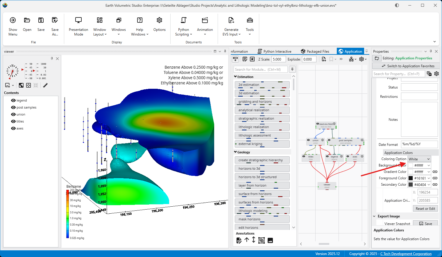
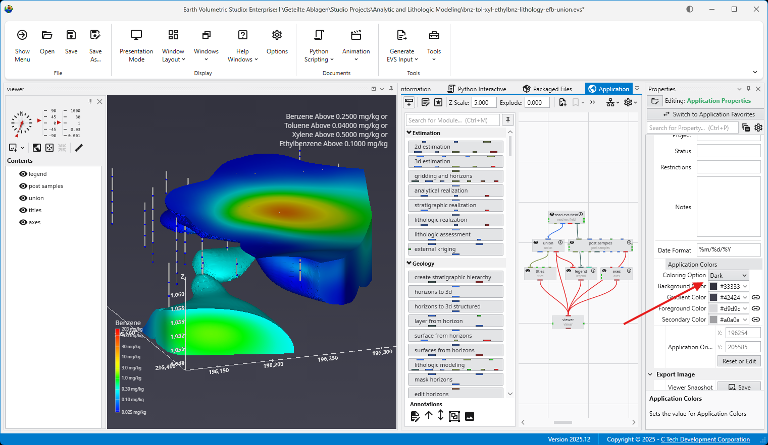
Example of Switching Coloring Option
When the modules’ color properties are linked, changing the Coloring Option has an immediate effect on the entire scene.
The application below is using the White Coloring Option. Note the dark text and lines on the title, axes, and legend, which provide high contrast against the light background.
By simply switching the Coloring Option to Dark, all linked modules automatically update. The text and lines change to a light color to maintain contrast against the new dark viewer background.
Light and dark themes can also be toggled in the Options panel in the Menu.