This section of the documentation provides a guide to the main components of the Earth Volumetric Studio (EVS) user interface. It is designed to help you understand the layout, functionality, and interaction between the different windows and tools that form the core of the application.
From the initial Startup Window to the detailed Properties panels and the powerful Viewer, these articles cover everything you need to know to navigate and manage your workspace effectively.
By familiarizing yourself with these components, you will be able to build, visualize, and analyze your projects more efficiently.
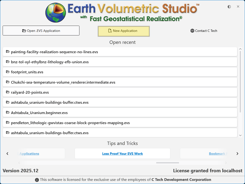
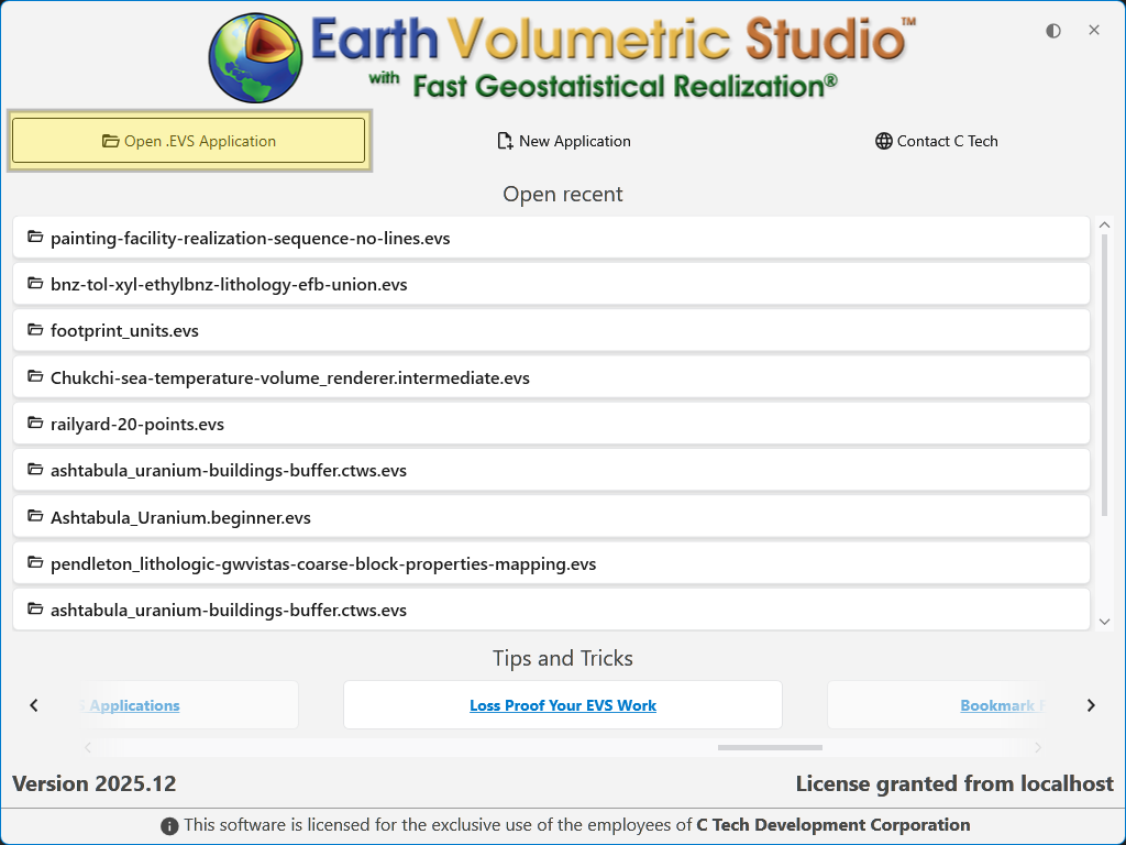
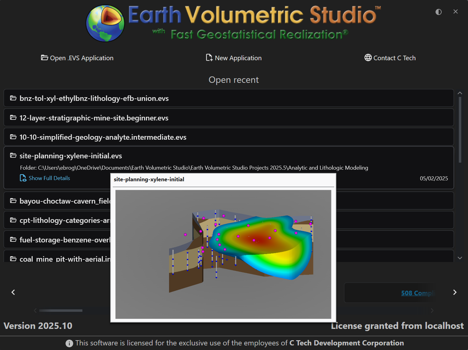
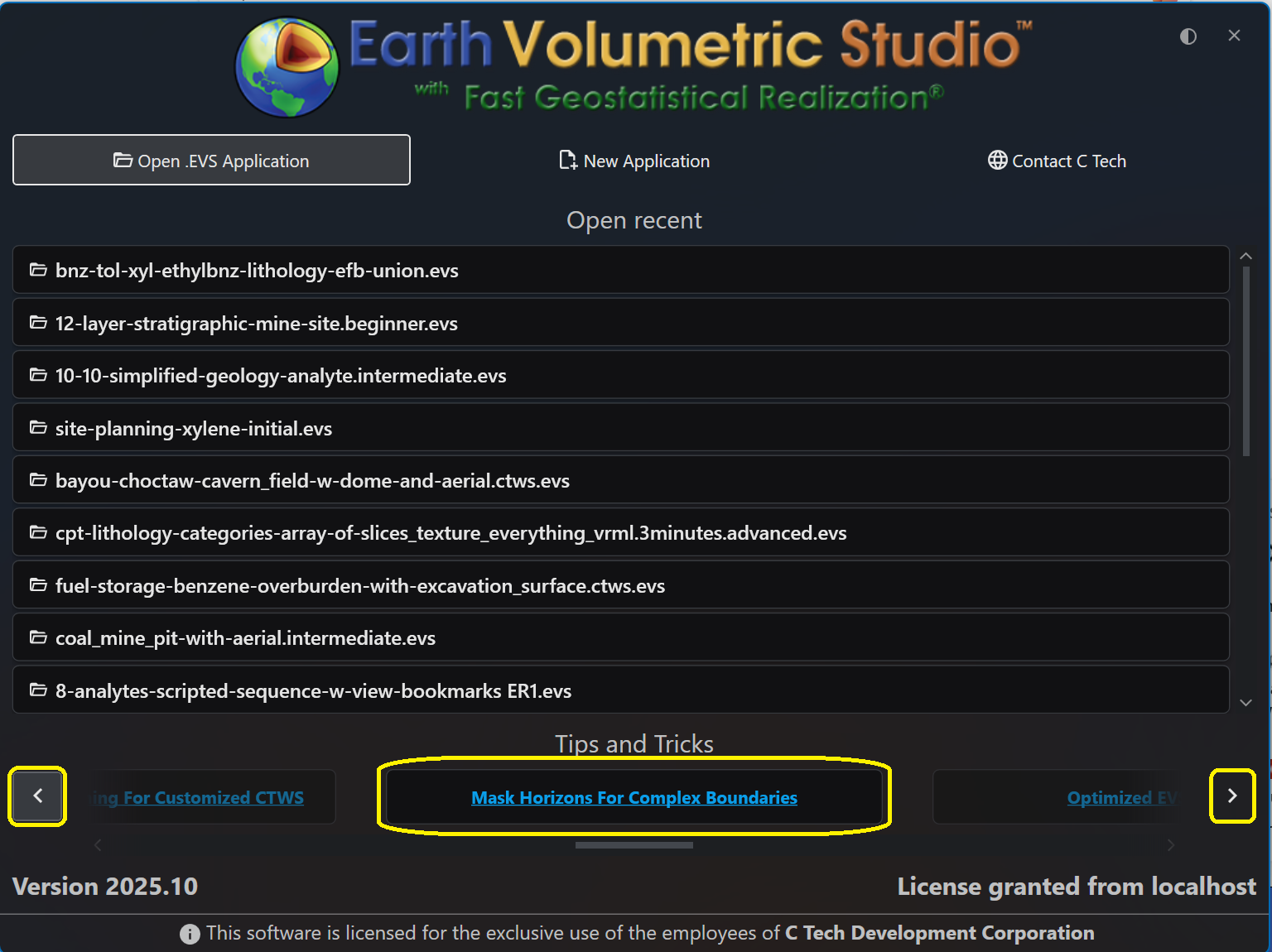
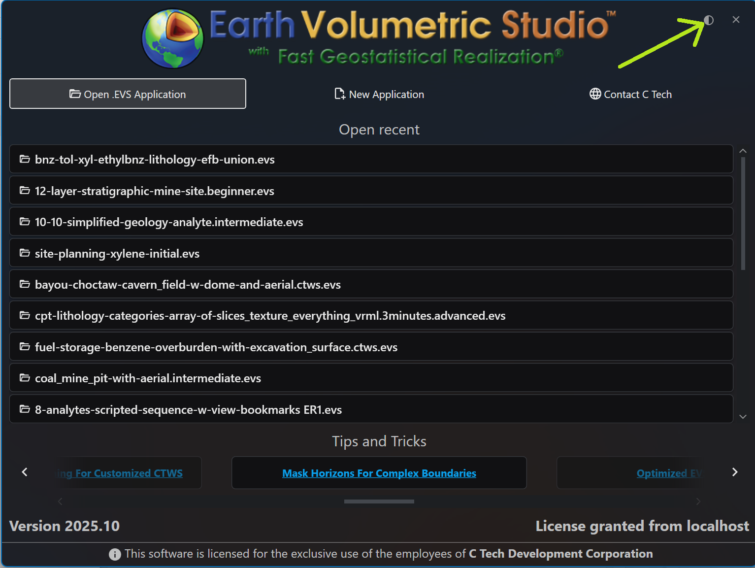
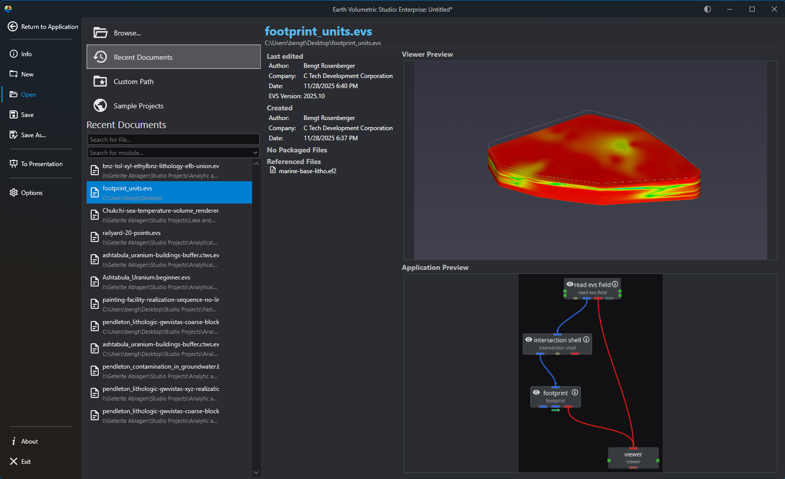
The Earth Volumetric Studio startup window is your launchpad for any project. From here, you can start with a clean slate by creating a new application, jump back into a previous project by opening an existing file, or access helpful resources. Licensing and Version Information The bottom of the window shows you the current version of EVS as well as well as your license status.
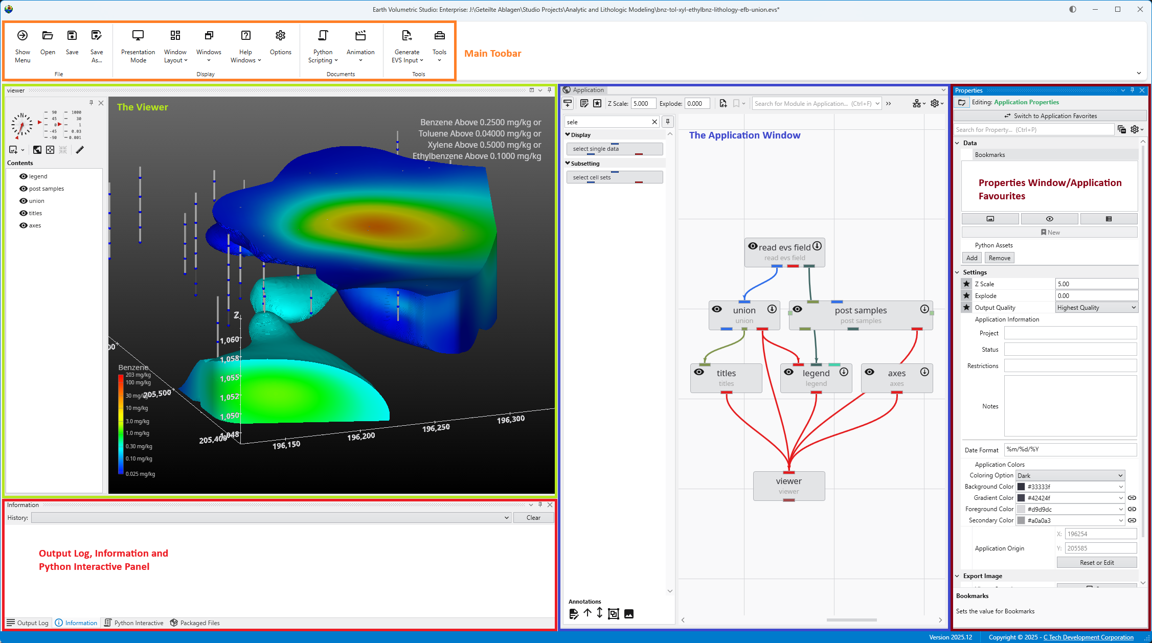
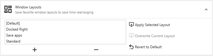
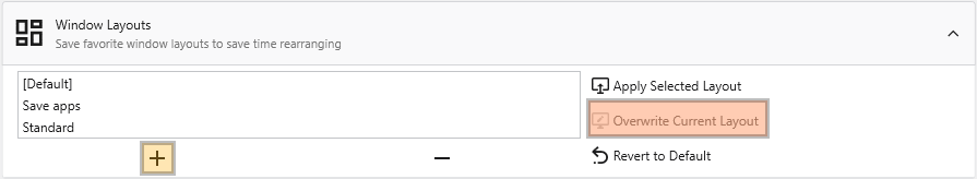
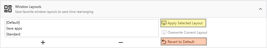
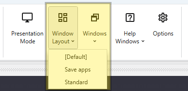
Getting Started with the EVS User Interface The main window is organized into five primary sections in the default layout configuration, each designed to provide a streamlined workflow for your data processing, visualization, and analysis needs. Most windows can be freely docked or undocked in any configuration and layouts can be loaded and saved.
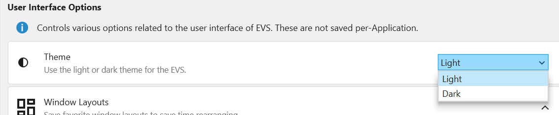
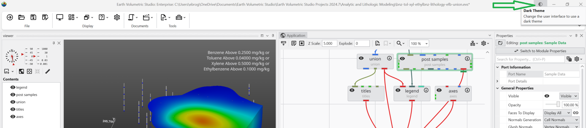
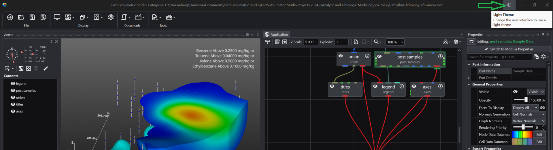
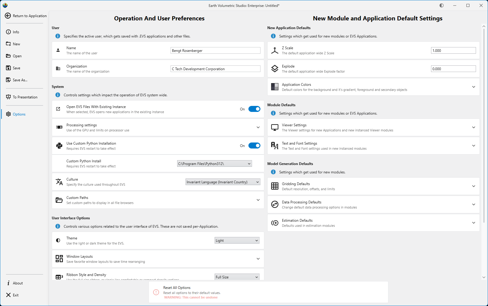
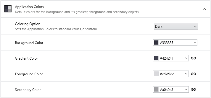
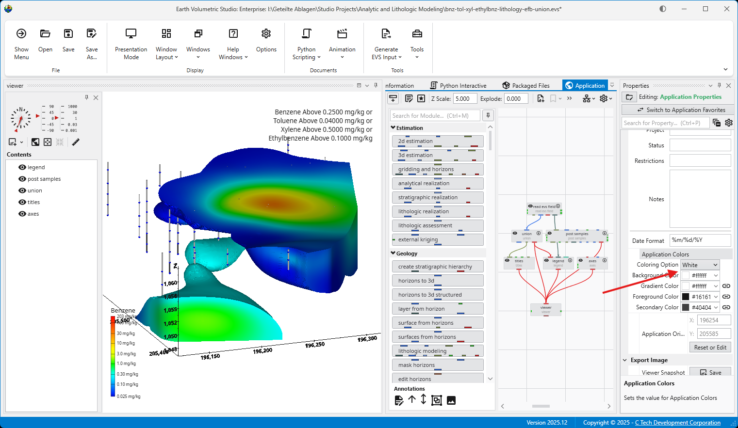
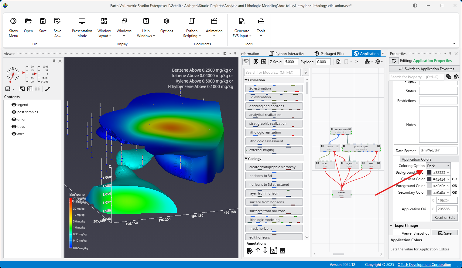
The application offers both a Light and a Dark theme to customize the appearance of the user interface. This choice is purely a matter of personal pre
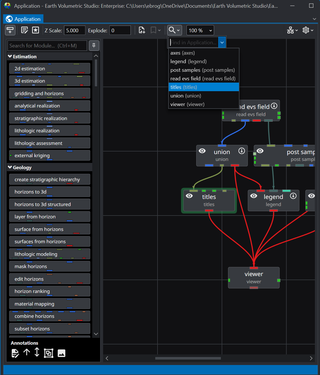
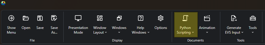
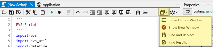
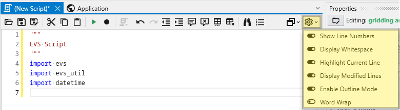
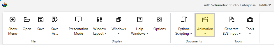
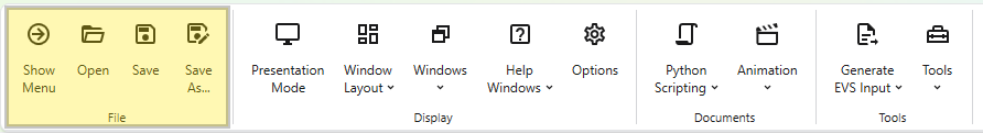
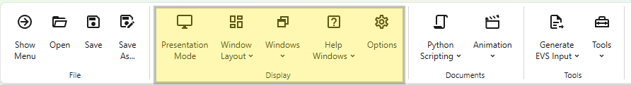
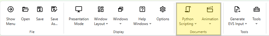
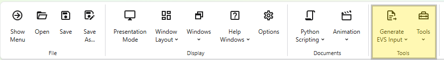
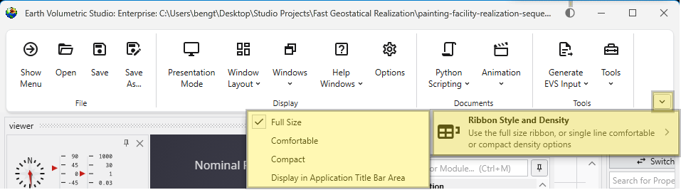
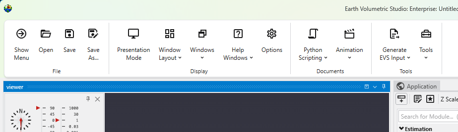
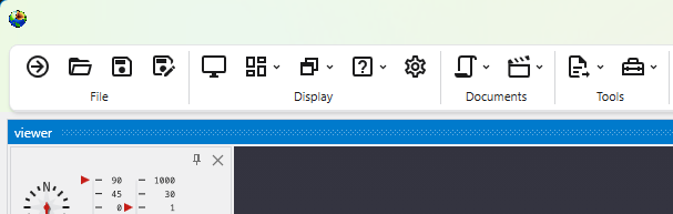
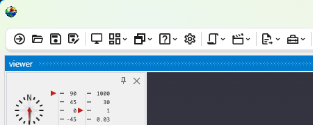
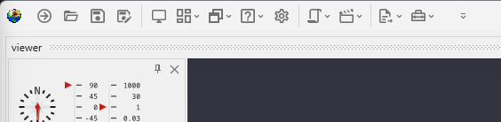
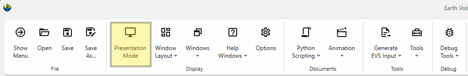
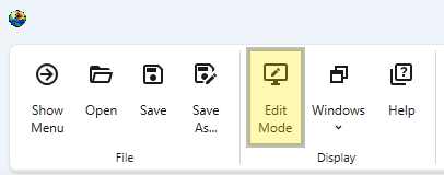
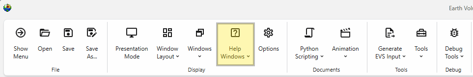
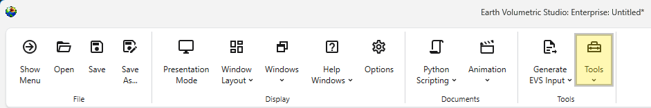
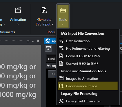
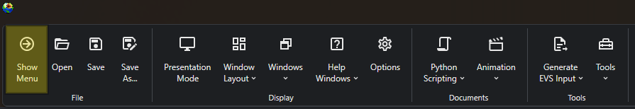
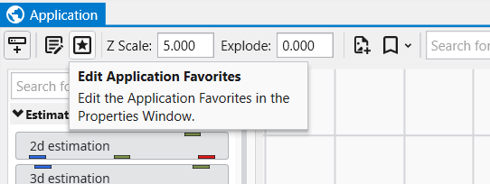
The Main Toolbar The Main Toolbar is the primary command bar in Earth Volumetric Studio, located at the top of the main application window. It provides streamlined access to the application’s most common features and functions. The toolbar is organized into logical sections: File, Display, Documents, and Tools, making it easier to locate and use the necessary commands for your projects.
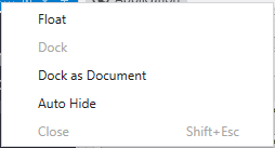
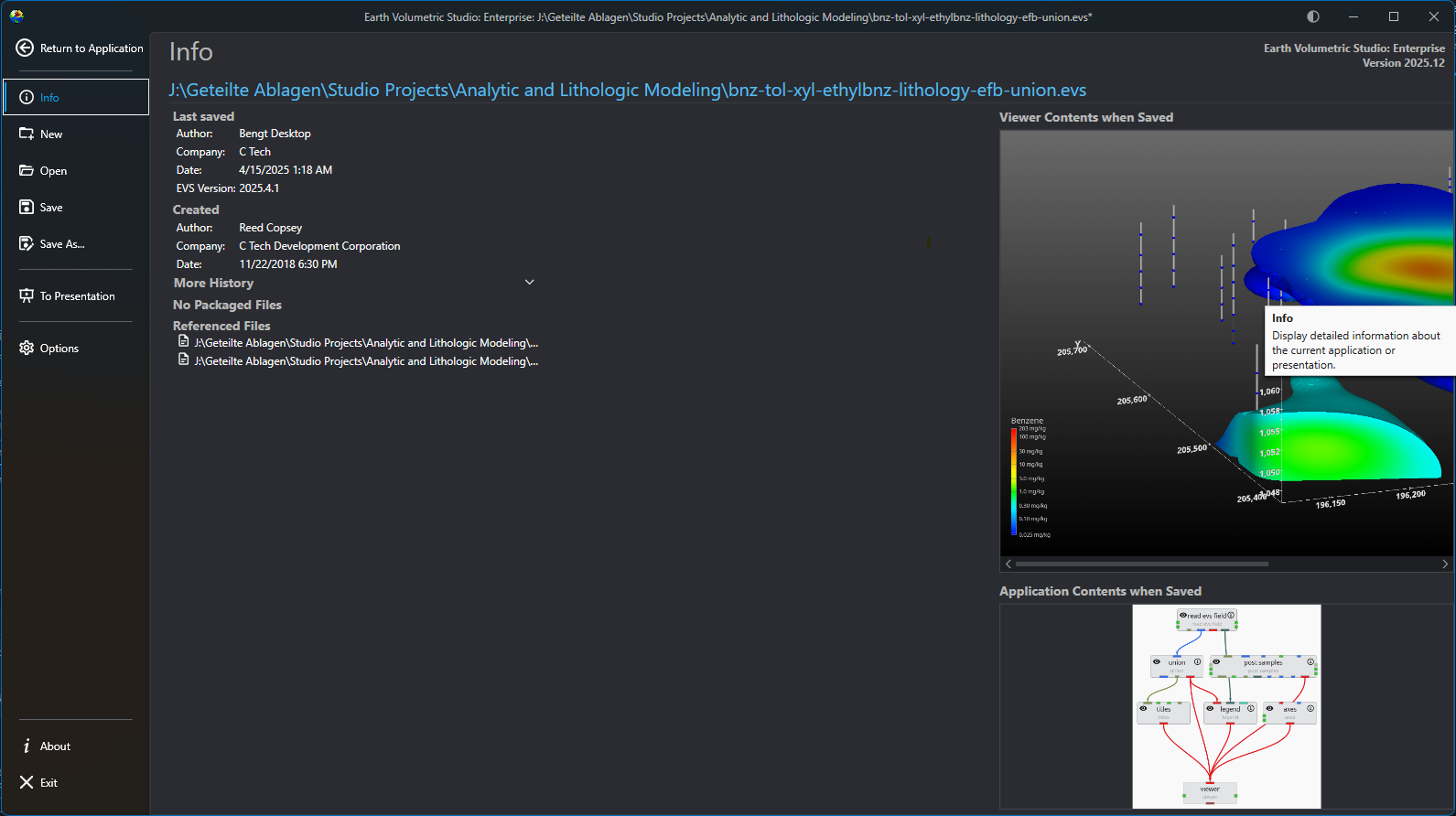
The main application menu serves as the central hub for managing your projects and configuring the application. Opening this menu will temporarily rep
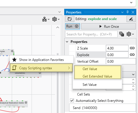
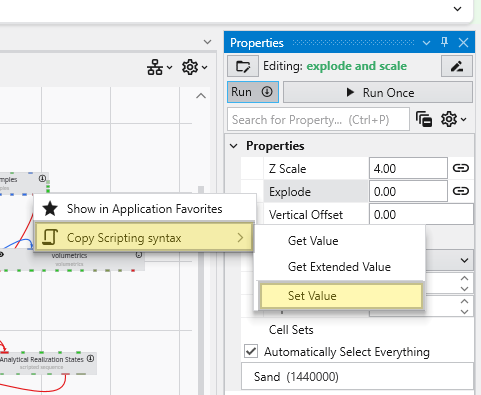
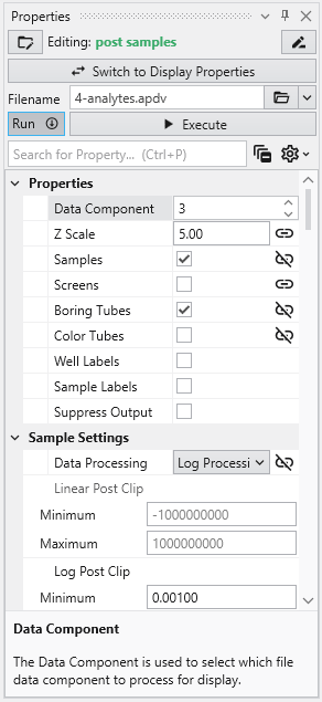
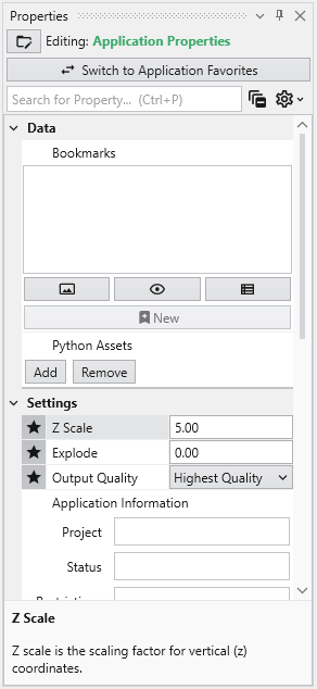
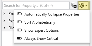
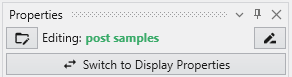
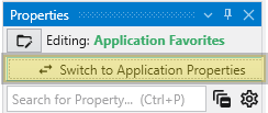
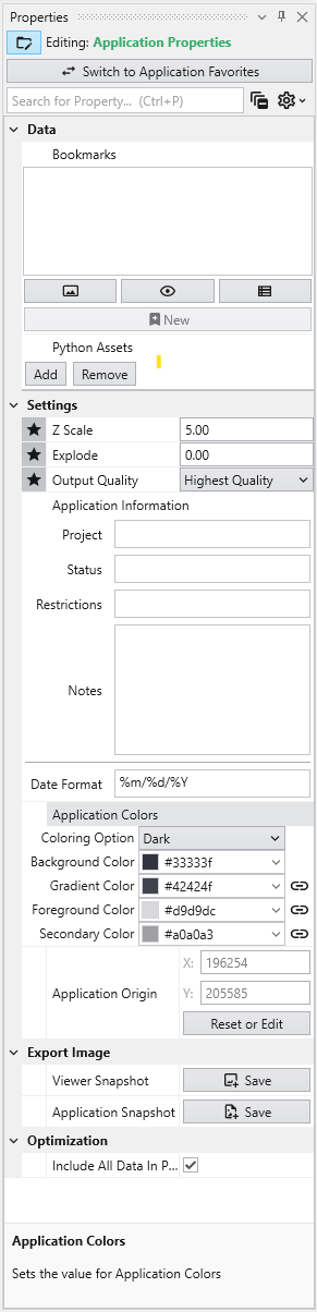
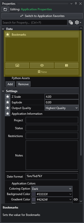
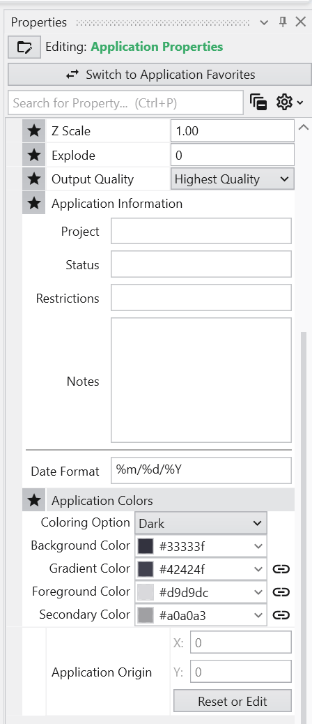
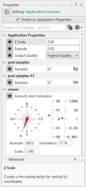
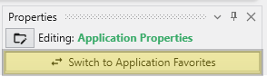
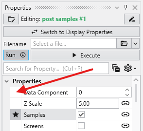
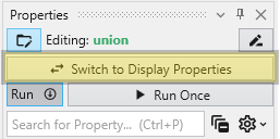
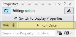
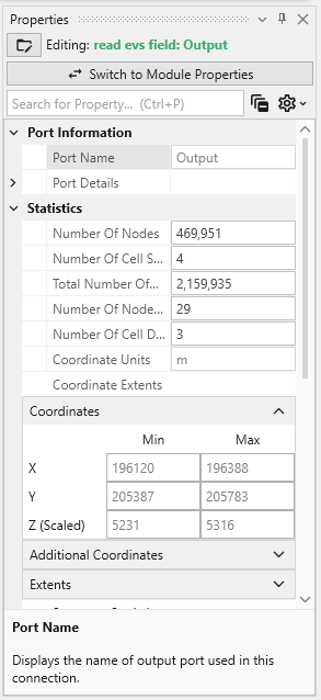
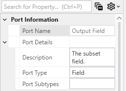
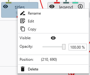
The Properties window is the primary interface in Earth Volumetric Studio for viewing and editing the parameters of various objects within your applic
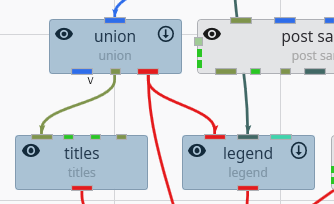
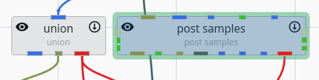
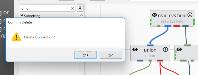
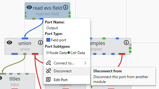
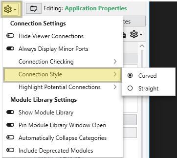
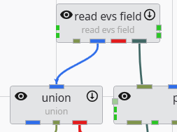
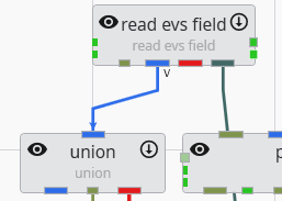
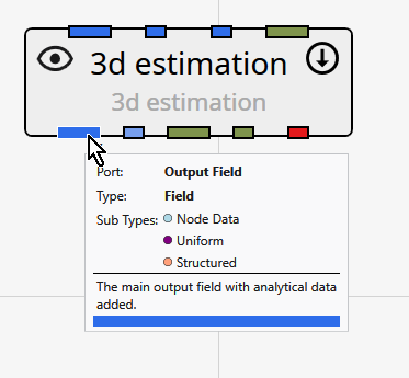
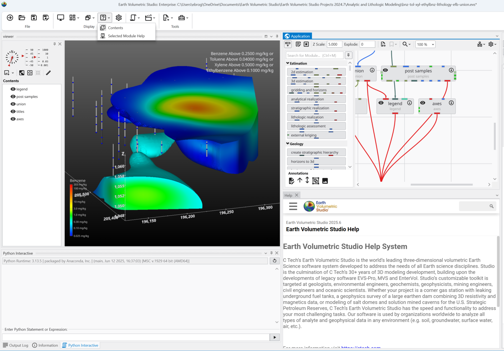
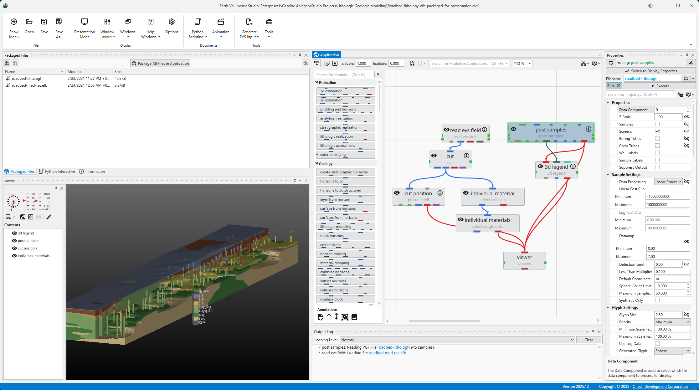
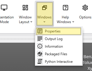
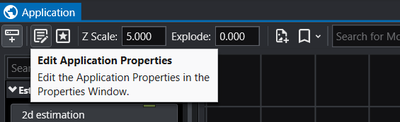
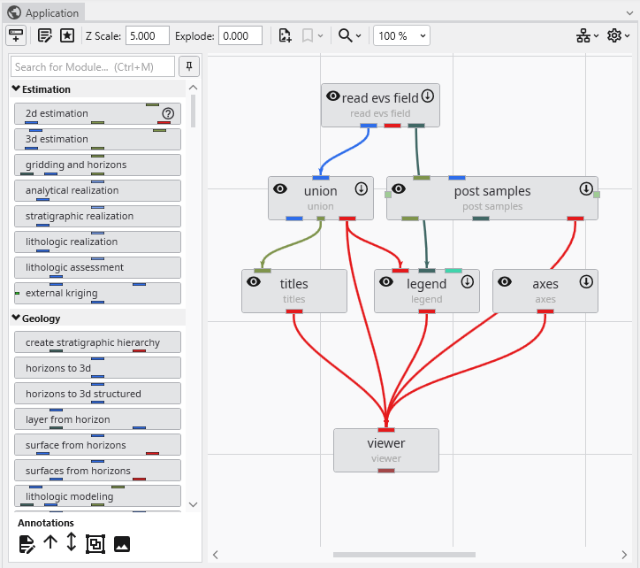
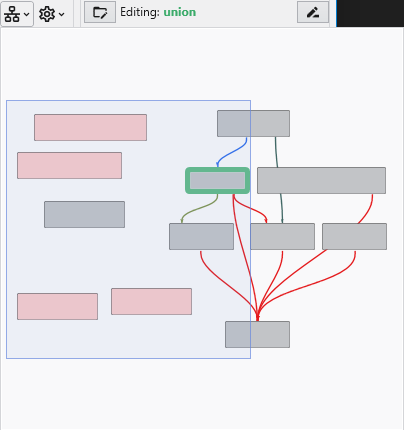
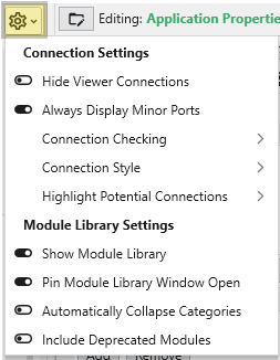
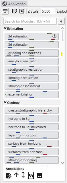
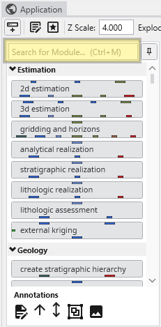
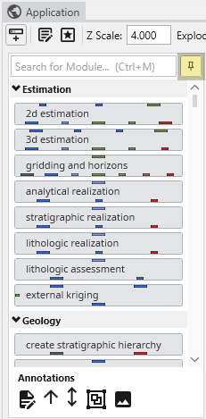
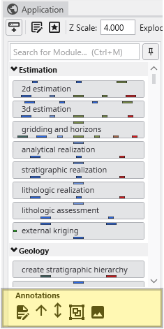
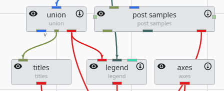
The Application window is the central workspace in Earth Volumetric Studio for creating and managing your data processing and visualization workfl
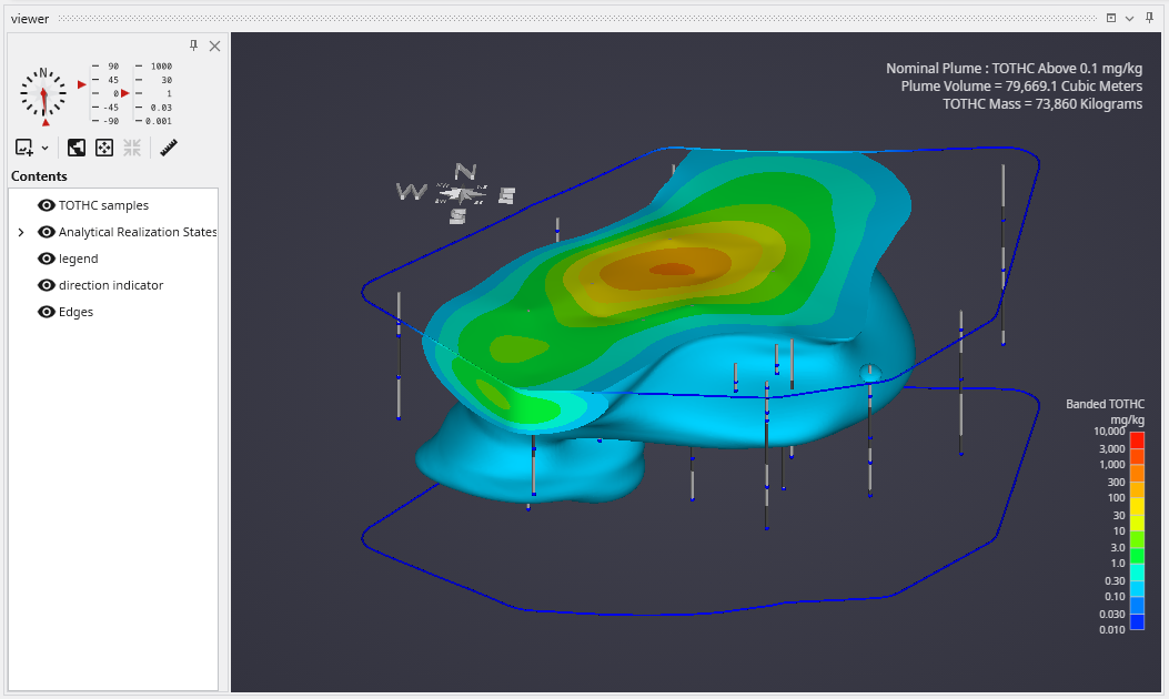
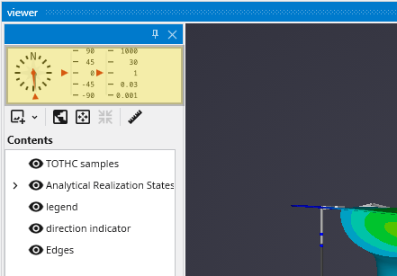
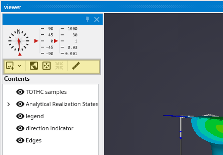
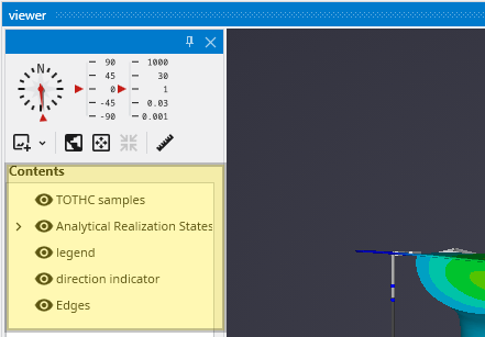
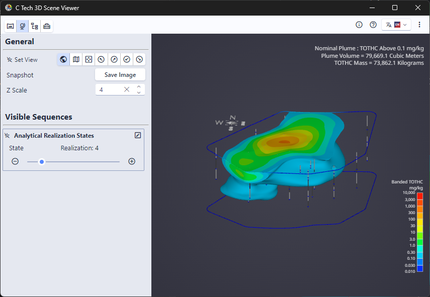
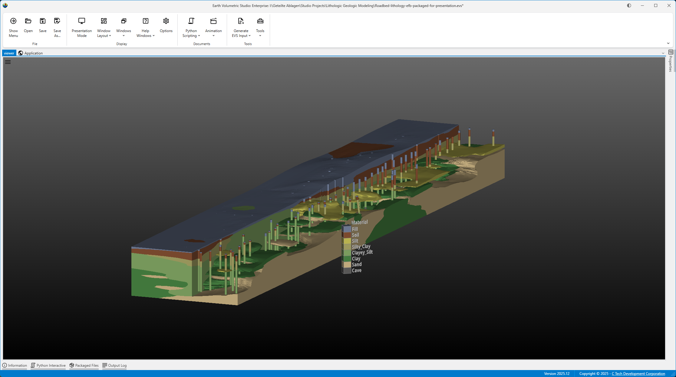
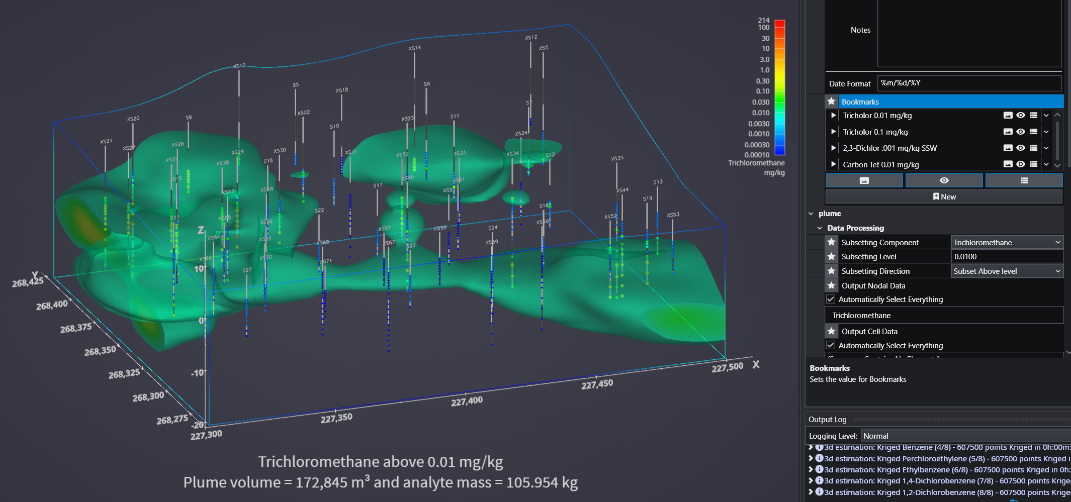
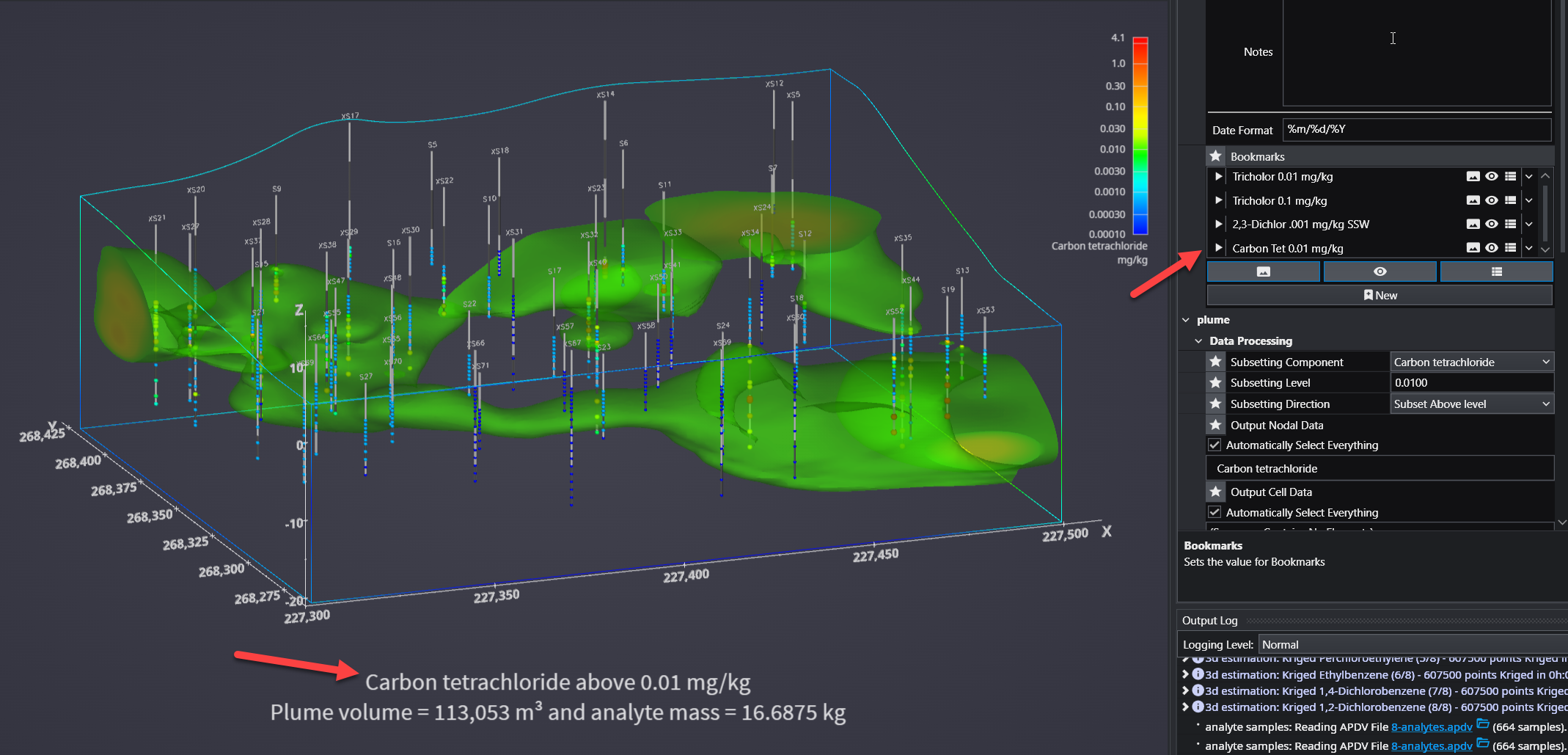
The Viewer is the primary 3D visualization window in Earth Volumetric Studio. It serves as the canvas where all the visual outputs from your Application Network - such as geologic layers, contaminant plumes, sample data, and annotations - are rendered and combined into a single, interactive scene. This is the main environment for exploring, analyzing, and presenting your 3D model.
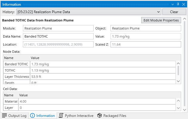
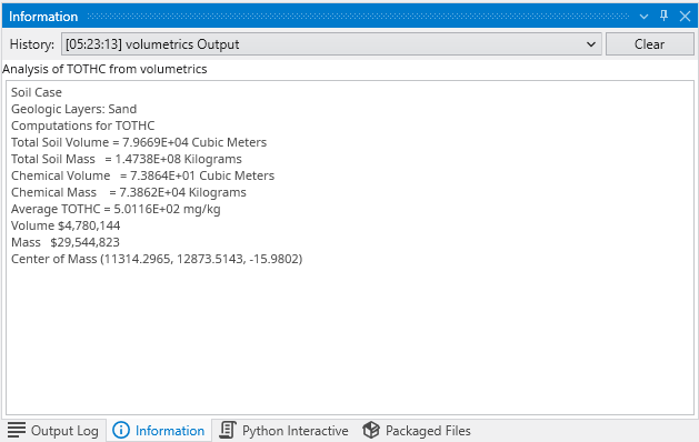
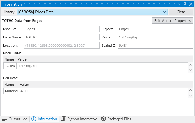
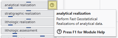
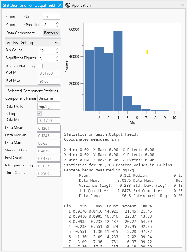
The Information Window provides detailed, contextual output from various components within Earth Volumetric Studio. Unlike the Output Log, which primarily displays text-based messages and system logs, the Information Window is designed to present data in a structured, readable, and often interactive format. It is commonly used by modules to display analysis reports or to show detailed data about a specific point in the model that a user has “picked” in the Viewer (via Ctrl+Left Mouse Click).
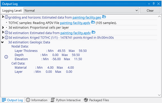
The Output Log window is a critical tool for monitoring the real-time status of Earth Volumetric Studio. It provides a chronological and hierarchical record of events, module execution details, warnings, and diagnostic messages. Whether you are running a complex analysis or troubleshooting an unexpected issue, the Output Log offers valuable insight into the application’s internal processes.
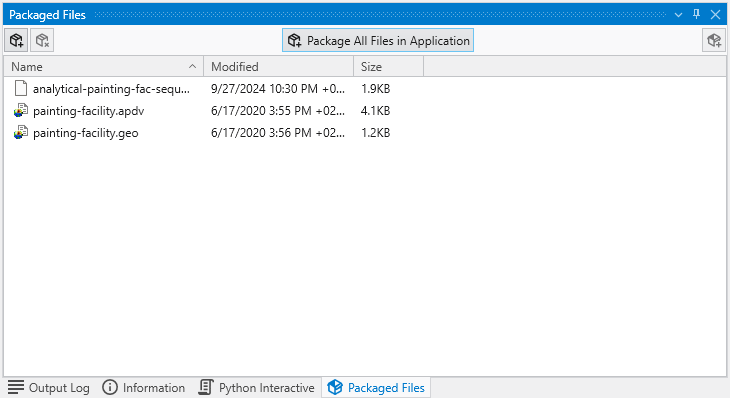
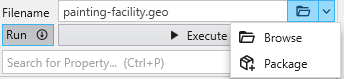
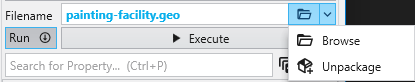
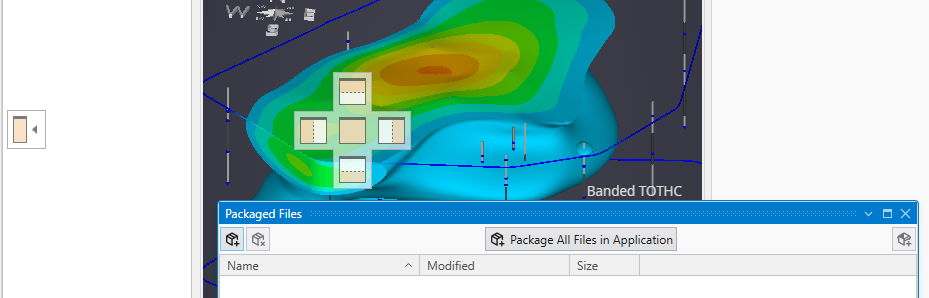
The Packaged Files feature in Earth Volumetric Studio provides a robust solution for managing project dependencies. Packaged Files are external data files that are embedded directly into your Earth Volumetric Studio application (.evs) file. This creates a completely self-contained project, ensuring that all necessary input files are always available. It eliminates the problem of broken file paths and the need to manually copy dependent files when sharing your application with colleagues or moving it to a different computer. While this increases the size of the application file, the benefit of portability is often more important.
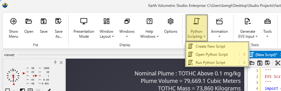
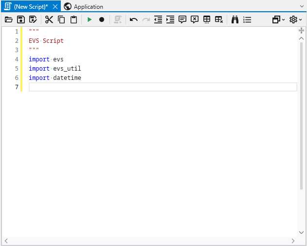
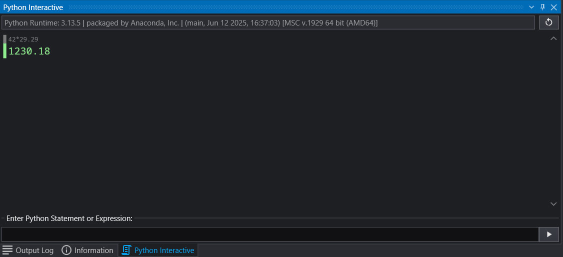
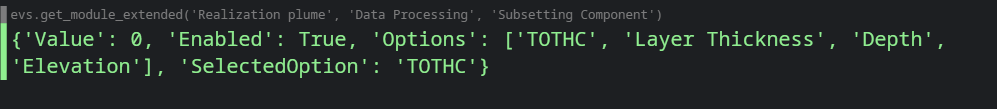
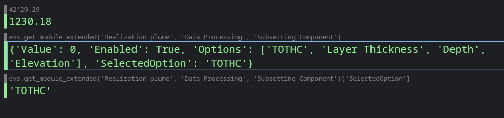
Introduction to Python Scripting Python scripting in Earth Volumetric Studio provides a method to programmatically control and automate virtually every aspect of the application. By leveraging the Python programming language, you can move beyond manual interaction to create dynamic, data-driven workflows, automate repetitive tasks, and perform custom analyses that are not possible with standard interface controls alone.
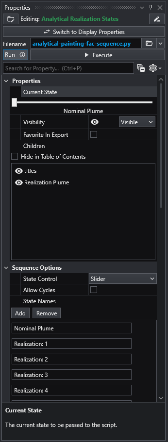
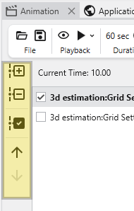
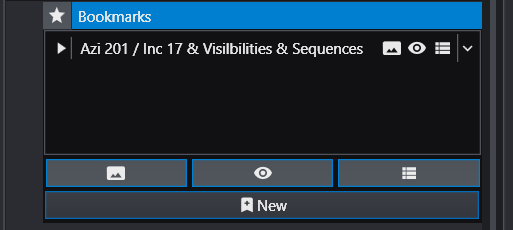
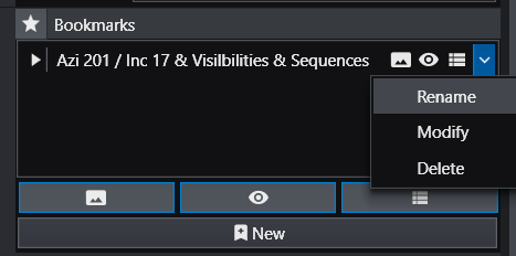
Sequences are used to create dynamic and interactive applications by managing an ordered collection of predefined “states.” A state can capture and control the properties of one or more modules simultaneously. This functionality allows you to guide a user through a narrative or a series of analytical steps, such as changing an isosurface level, animating a cutting plane through a model, or stepping through time-based data.
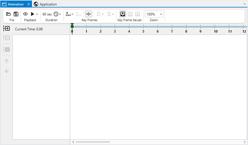
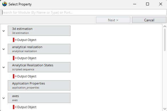
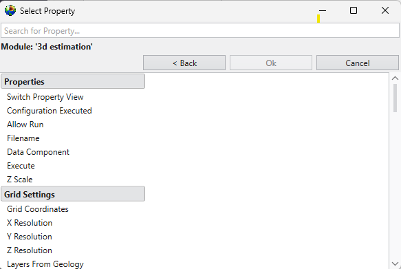
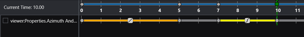
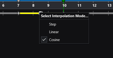
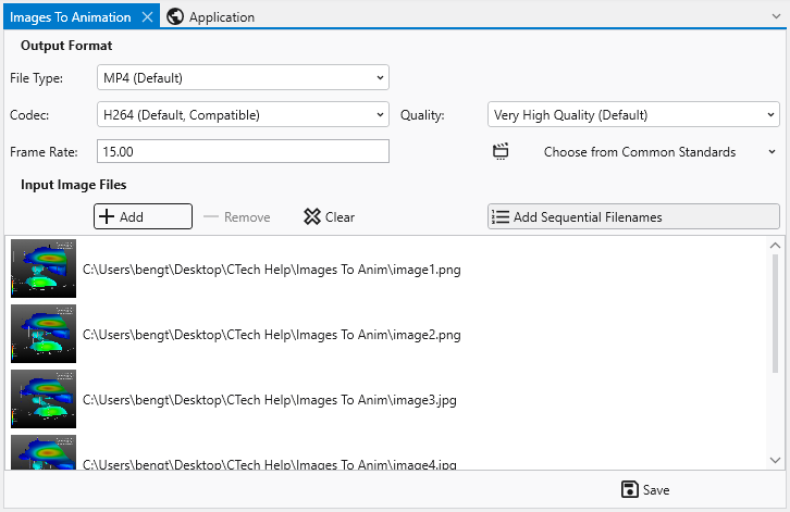
Animations in EVS Animations allow you to generate video files of smoothly changing content and views. This allows for complete control over the messaging conveyed in a single, often small deliverable file. In Earth Volumetric Studio, an animation is built from one or more timelines. Each timeline represents a single, animatable property within your application. This could be anything from the camera’s position in the 3D viewer to the visibility of a specific object, a numeric value like a plume level, or the current frame of a sequence.


