Spatial interpolation methods are used to estimate measured data to the nodes in grids that do not coincide with measured points. The spatial interpolation methods differ in their assumptions, methodologies, complexity, and deterministic or stochastic nature.
Inverse Distance Weighted Inverse distance weighted averaging (IDWA) is a deterministic estimation method where values at grid nodes are determined by a linear combination of values at known sampled points. IDWA makes the assumption that values closer to the grid nodes are more representative of the value to be estimated than samples further away. Weights change according to the linear distance of the samples from the grid nodes. The spatial arrangement of the samples does not affect the weights. IDWA has seen extensive implementation in the mining industry due to its ease of use. IDWA has also been shown to work well with noisy data. The choice of power parameter in IDWA can significantly affect the interpolation results. As the power parameter increases, IDWA approaches the nearest neighbor interpolation method where the interpolated value simply takes on the value of the closest sample point. Optimal inverse distance weighting is a form of IDWA where the power parameter is chosen on the basis of minimum mean absolute error.
Once the model of the site has been created, visually communicating the information about that site generally requires subsetting the model. Subsettin
Subsections of Visualization Fundamentals
As defined above, our discussion of environmental data will be limited to data that includes spatial information. When spatial data is collected with a GPS (Global Positioning Satellite) system, the spatial information is often represented in latitude and longitude (Lat-Lon). Generally, before this data is visualized or combined with other data, it is converted to a Cartesian coordinate system. The process of converting from Lat-Lon to other coordinate systems is called projection. Many different projections and coordinate systems can be used. The single most important thing is maintaining consistency. Projecting this data is especially necessary for three-dimensional visualization because we want to maintain consistent units for x, y, and z coordinates. Latitude and longitude angle units (degrees, minutes and seconds) do not represent equal lengths and there is no equivalent unit for depth. Projections convert the angles into consistent units of feet or meters.
analyte (e.g. chemistry)
analyte (e.g. chemistry) data files must contain the spatial information (x, y, and optional z coordinates) as well as the measured analytical data. The file should specify the name of the analyte and should include information about the detection limits of the measured parameter. The detection limit is necessary because samples where the analyte was not detected are often reported as zero or “nd”. It is generally not adequate (especially when logarithmically processing this data) to merely use a value of 0.0.
If we want to be able to create a graphical representation of the borings or wells from which the samples were taken, the analyte (e.g. chemistry) data file should also include the boring or well name associated with each sample and the ground surface elevation at the location of that boring.
Geologic information is considerably more difficult to represent in a single, unified data format because of its nature and complexity. Geologic data files can be grouped into one of two classes, those representing interpreted geology and those representing boring logs. By some definitions, boring logs are interpreted since a geologist was required to assign materials based on core samples or some other quantitative measurements. However, for this discussion interpreted geology data will be defined as data organized into a geologic hierarchy.
C Tech’s software utilizes one of two different ASCII file formats for interpreted geologic information. These two file formats both describe points on each geologic surface (ground surface and bottom of each geologic layer), based on the assumption of a geologic hierarchy. Simply stated, geologic hierarchy requires that all geologic layers throughout the domain be ordered from top to bottom and that a consistent hierarchy be used for all borings. At first, it may not seem possible for a uniform layer hierarchy to be applicable for all borings. Layers often pinch out or exist only as localized lenses. Also layers may be continuous in one portion of the domain, but are split by another layer in other portions of the domain. However, all of these scenarios and many others can be usually be modeled using a hierarchical approach.
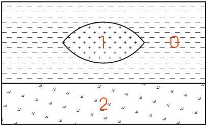
The easiest way to describe geologic hierarchy is with an example. Consider the example above of a clay lens in sand with gravel below.
Imagine borings on the left and right sides of the domain and one in the center. Those outside the center would not detect the clay lens. On the sides, it appears that there are only two layers in the hierarchy, but in the middle there are three materials and four layers.
EVS’s & MVS’s hierarchical geologic modeling approach accommodates the clay lens by treating every layer as a sedimentary layer. Because we can accommodate “pinching out” layers (making the thickness of layers ZERO) we are able to produce most geologic structures with this approach. Geologic layer hierarchy requires that we treat this domain as 4 geologic layers. These layers would be Upper Sand (0), Clay (1), Lower Sand (2) and Gravel (3).
If desired, both Upper and Lower Sand can have identical colors or hatching patterns in the final output.
Figure 0.1 Geologic Hierarchy of Clay Lens in Sand
When this geologic model is visualized in 3D, both Upper and Lower Sand can have identical colors or hatching patterns. Since the layers will fit together seamlessly, dividing a layer will not change the overall appearance (except when layers are exploded).
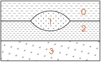
For sites that can be described using the above method, it is generally the best approach for building a 3D geologic model. Each layer has smooth boundaries and the layers (by nature of hierarchy) can be exploded apart to reveal the individual layer surface features. An example of a much more complex site is shown below in Figure 1.3. Sedimentary layers and lenses are modeled within the confines of a geologic hierarchy.
Figure 0.2 Complex Geologic Hierarchy
The hierarchical borehole based geology file format used for Figure 1.3 is described in the chapter on Borehole Geology Files.
With C Tech’s EVS software, there are two other geology file formats. One of them is a more generic format for interpreted (hierarchical) geologic information. With that format; x, y, and z coordinates are given for each surface in the model. There is no requirement for the points on each surface to have coincident x-y coordinates or for each surface to be defined with the same number of points. The borehole geology file format described above could always be represented with this more generic file format.
The last file format is used to represent the materials observed in each boring. Borings are not required to be vertical, nor is there any requirement on the operator to determine a geologic hierarchy. C Tech refers to this file format as Pregeology referring to the fact that it is used to represent raw 3D boring logs. This format is also considered to be “uninterpreted”. This is not meant to imply that no form of geologic evaluation or interpretation has occurred. On the contrary, it is required that someone categorizes the materials on the site and in each boring.
In C Tech’s EVS software, the raw boring data can be used to create complex geologic models directly using a process called Geologic Indicator Kriging (GIK). The GIK process begins by creating a high-resolution grid constrained by ground surface and a constant elevation floor or some other meaningful geologic surface such as rockhead. For each cell in the grid, the most probable geologic material is chosen using the surrounding nearby borings. Cells of common material are grouped together to provide visibility and rendering control over each material.
Many methods of environmental data visualization require mapping (interpolation and/or extrapolation) of sparse measured data onto some type of grid. Whenever this is done, the visualization includes assumptions and uncertainties introduced by both the gridding and interpolation processes. For these reasons, it is crucial to incorporate direct visualization of the data as a part of the entire process. It becomes the operator’s responsibility to ensure that the gridding and interpolation methods accurately represent the underlying data.
A common means for directly visualizing environmental data is to use glyphs. A “glyph” refers to a graphical object that is used as a symbol to represent an object or some measured data. For the purposes of this paper, glyphs will be positioned properly in space and may be colored and/or sized according to some data value. For a graphics display, the simplest of all glyphs would be a single pixel. A pixel is a dot that is drawn on the computer screen or rendered to a raster image. The issue of pixel size often creates confusion. Pixels (by definition) do not have a specific size. Their apparent size depends on the display (or printer) characteristics. On a computer screen, the displayed size of a pixel can be determined by dividing the screen width in inches or millimeters by the screen resolution in pixels. For example, a 19" computer monitor has a screen width of about 14.5 inches. If the “Desktop Area” is set to 1280 by 1024, the width of a pixel would be approximately 0.011 inches (~0.29 mm). If the “Desktop Area” were reduced, the apparent size of a pixel would increase.
There are virtually no limits to the type of glyph objects that may be used. Glyphs can be simple geometric objects (e.g. triangles, spheres, and cubes) or they can be representations of real-world objects like people, trees or animals.
Glyphs in 3D
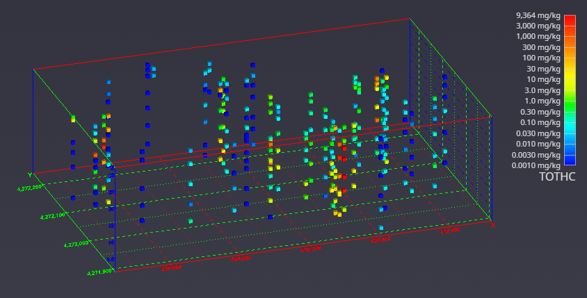
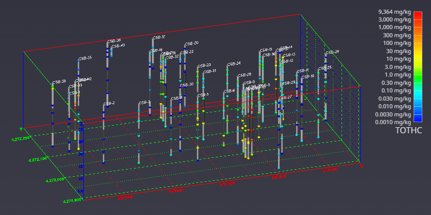
It is once we move to the three-dimensional world that glyphs become much more interesting. In Figure 1.5, cubes (hexahedron elements) are positioned, sized and colored to represent chemical measurements made in soil at a railroad yard in Sacramento, California. Axes were added to provide coordinate references and this picture was rendered with perspective effects turned on. This results in a visualization where parallel lines do not remain parallel and objects in the foreground appear larger than those in the background.
Figure 0.4 Three-Dimensional Cubic Glyphs
When representations of the borings are added, the figure becomes much more useful. Figure 1.6 shows the sample represented by colored spheres and tubes represent the borings. The tubes are colored alternating dark and light gray where the color changes on ten-foot intervals. This provides a reference to allow the viewer to quickly determine the approximate depth of the samples. The borings are also labeled with their designation. These last two figures both represent the same data, however it is clear which one provides the most useful information.
Figure 0.5 Three-Dimensional Glyphs with Boring Tubes
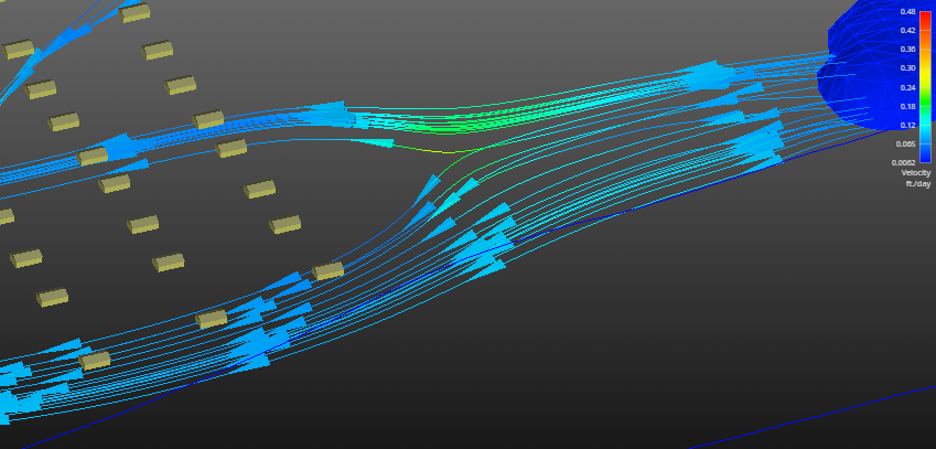
Glyphs can also be used to represent vector data. The most commonly encountered vector data represents ground water flow velocity. In this case, the glyph is not only colored and sized according to the magnitude of the velocity vector, but the glyph can also be oriented to point in the vector’s direction. For this type of application, an assymetric glyph (as opposed to a sphere or cube) is used. Figure 1.7 uses a glyph that is referred to as “jet”. It is an elongated tetrahedron that points in the direction of the vector. The data represented in this figure is predicted velocities output.
Figure 0.6 Three-Dimensional Glyphs Representing Vector Data
Although there is great value in directly visualizing measured data; it does have many limitations. Without mapping sparse measured data to a grid, computation of contaminant areas or volumes is not possible. Further, the techniques available for visualizing the data are very limited. For these reasons and more, significant attention should be paid to the process of creating a grid into which the data will be interpolated and extrapolated.
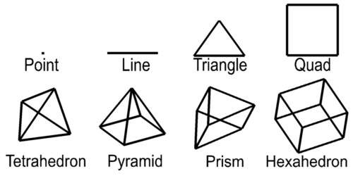
For this paper, a grid is defined as a collection of nodes and cells. Nodes are points in two or three-dimensions with coordinates and usually one or more data values. The word “cell” and “element” are both used as a generic term to refer to geometric objects. The cell type and the nodes that comprise their vertices define these objects. Commonly used cell types are described in Table 1.1 and Figure 1.2.
Cell Type
Number of Nodes
Dimensionality
Point
1
0
Line
2
1
Triangle
3
2
Quadrilateral
4
2
Tetrahedron
4
3
Pyramid
5
3
Prism
6
3
Hexahedron
8
3
Table 1.1 Common Cell Types
Dimensionality refers to the space occupied by the cell. Points have do not have length, width, or height, therefore their dimensionality is zero (0). Lines are dimensionality “1” because they have length. Dimensionality 2 objects such as quadrilaterals (quad) and triangles have area and dimensionality 3 objects ranging from tetrahedrons (tet) to hexahedrons (hex) are volumetric. When creating a two-dimensional grid, areal cells are used and for three-dimensional grids, volumetric cells are used.
Figure 1.2 Common Cell Types
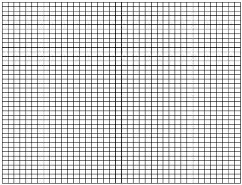
Rectilinear (a.k.a. uniform) grids are among the simplest type of grid. The grid axes are parallel to the coordinate axes and the cells are always rectangular in cross-section. The positions of all the nodes can be computed knowing only the coordinate extents of the grid (minimum and maximum x, y and optionally z). Two-dimensional rectilinear grids are comprised of quadrilateral cells. For a 2D grid with i nodes in the x direction and j nodes in the y direction, there will be a total of (i - 1)*(j - 1) cells.
The connectivity of the cells (the nodes that define each cell) can be implicitly determined because the nodes and cells are numbered in an orderly fashion. The advantages of rectilinear grids include the ease of creating them and the uniformity of cell area in 2D and cell volume in 3D. The disadvantages are that grid nodes are generally not coincident with the sample data locations and large areas of the grid may fall outside of the bounds of the data. A simple two-dimensional rectilinear grid is shown in Figure 1.9.
Figure 0.8 Two-Dimensional Rectilinear Grid
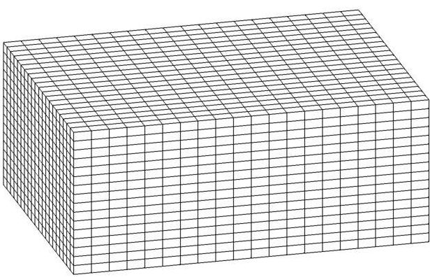
Three-dimensional rectilinear grids offer the simplest method for gridding a volume. They are constrained to rectangular parallel piped volumes and have hexahedral cells of constant size. (See Figure 1.10) For some processes and visualization techniques such as volume rendering, this is advantageous and may even be required. For a grid having i by j by k nodes there will be (i-1) * (j-1) * (k-1) hexahedron cells whose connectivity can be implicitly derived.
Figure 0.9 Three-Dimensional Rectilinear Grid
Finite Difference
The following type of grid derives its name from the numerical methods that it employs. Simulation software such as the USGS’s MODFLOW utilizes a finite difference numerical method to solve equilibrium and transient ground water flow problems. This solution method requires a grid that contains only rectangular cells. However the cells need not be uniform in size. For two-dimensional grids, this results in rectangular cells, however it is possible that no two cells are precisely the same size. Some simulation software requires that finite difference grids be aligned with the coordinate axes. EVS does not impose this restriction, but it does provide a means to export the grid transformed so that the grid axes are aligned. Figure 1.11 shows a rotated 2D finite difference grid. Smaller cells are concentrated in areas of the model where there are significant gradients in the data. For groundwater simulations this is usually where wells are located. For environmental contamination it should be the location of spills or areas where DNAPL (dense non-aqueous phase liquids) contaminant plumes were detected. The smaller cells provide greater accuracy in estimating the parameter(s) of interest.
Three-dimensional finite difference grids have the same restrictions as 2D grids with respect to their x and y coordinates (cell width and length). However, the z coordinates of the grid (which define the cell thicknesses) are allowed to vary arbitrarily. This allows for creation of a grid that follows the contours of geologic surfaces. For a grid having i by j by k nodes there will be (i-1) * (j-1) * (k-1) hexahedron cells whose connectivity can be implicitly derived. However the coordinates of the nodes for this grid must be explicitly specified. Figure 1.12 shows the grid created to model the migration of a contaminant plume in a tidal basin.
The convex hull of a set of points in two-dimensional space is the smallest convex area containing the set. In the x-y plane, the convex hull can be visualized as the shape assumed by a rubber band that has been stretched around the set and released to conform as closely as possible to it. The area defined by the convex hull offers significant advantages. Within the convex hull all parameter estimates are interpolations. The convex hull best fits the spatial extent of the data. Remember that the convex hull defines an area. That area can be gridded in many ways. EVS grids convex hull regions with quadrilaterals. Smoothing techniques are used to create a grid that has reasonably equal area cells. A two-dimensional example of a convex hull grid is shown in Figure 1.13. In this example, the domain of the model was offset by a constant amount from the theoretical convex hull. This results in rounded corners and a model region that is larger than the convex hull.
Figure 0.12 Convex Hull Grid with Offset
Adaptive Gridding
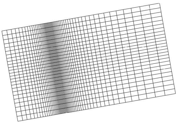
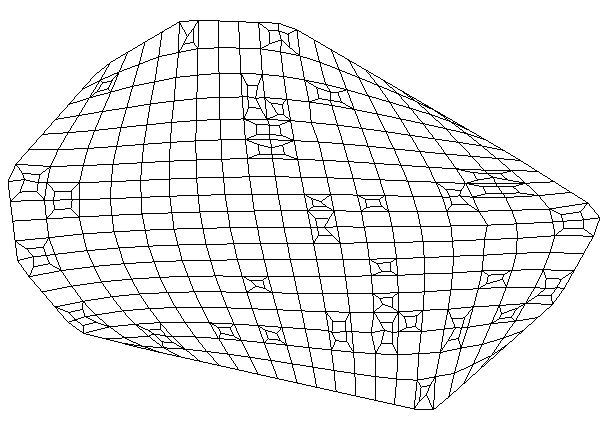
Adaptive gridding is the localized refinement of a grid to provide higher resolution in the areas or volumes surrounding measured sample data. Adaptive gridding or grid refinement can be accomplished in many different ways. In EVS, rectilinear, finite difference and convex hull grids can all be refined using a similar method. In two-dimensions a new node is placed precisely at the measured sample data location. Three additional nodes are placed to create a small quadrilateral cell within the cell to be refined. The corners of the small cell are connected to the corresponding corners of the cell being refined creating a total of five cells where the one previously was. The resulting nodal locations and grid connectivity must be explicitly defined.
Adaptively gridding offers many advantages. It assures that there will always be nodes at the precise coordinates of the sample data. This insures that the data minimum and maximum in the gridded model will match the sample data. It also provides greater fidelity in defining data trends in regions with high gradients. Figure 1.14 shows a two-dimensional adaptively gridded convex hull model. This model’s area was also offset from the convex hull. Since each sample data point results in a refined region, and the sample points define the convex hull, the regions in each corner of the model contain adaptively gridded cells.
Figure 0.13 Adaptively Gridded Convex Hull Grid
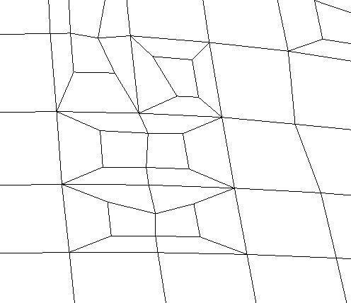
Figure 1.15 is a close-up view of some refined cells near the lower right in Figure 1.14. It shows one of the special cases. If the point to be refined falls very near an existing cell edge, that edge is refined and the cells on either side of the edge are symmetrically refined. Since the edge must be broken into three segments, the cells on both sides must be affected.
Figure 0.14 Close-up of Figure 1.14
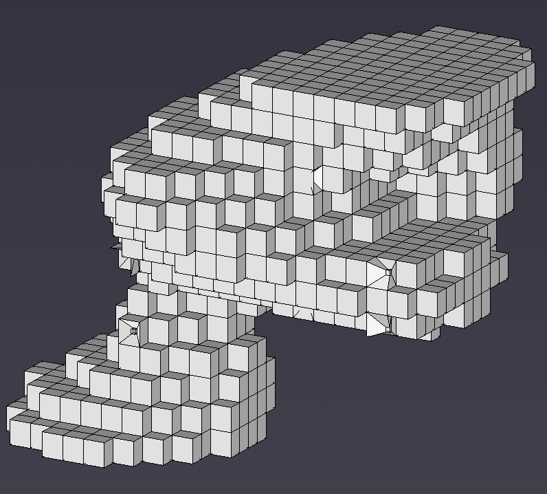
The refinement process can also be applied to all types of 3D grids. When a sample falls in a hexahedron (hex) cell, a new much smaller hex cell is created with one of its’ corners located precisely at the coordinates of the sample point. The eight corners of the small cell are connected to the corresponding corners of the parent cell. This creates 7 hex cells that fully occupy the volume of the original cell. Since the 3D-refinement process occurs internal to the volume of the model, it is more difficult to visualize the process. In order to see the refined cells, removing all cells in the grid with any nodes that were below a thresholded concentration level created Figure 1.16. By choosing the threshold properly, several of the refined cells become visible.
Figure 0.15 3D Adaptively Gridded Model
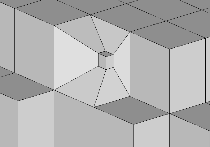
This figure (Figure 1.17) is an enlarged view of the right hand corner. It reveals the structure, relative sizes and connectivity resulting from 3D adaptive gridding.
Figure 0.16 Close-up of Figure 1.16
Triangular networks are defined as grids of triangle or tetrahedron cells where all of the nodes in the grid are exclusively those in the sample data. For these types of grids, the cell connectivity must be explicitly defined. In two dimensions, these grids are referred to as Triangulated Irregular Networks or TINs. The 3D equivalent grids are Tetrahedral Irregular Networks.
Triangulated Irregular Networks – 2D
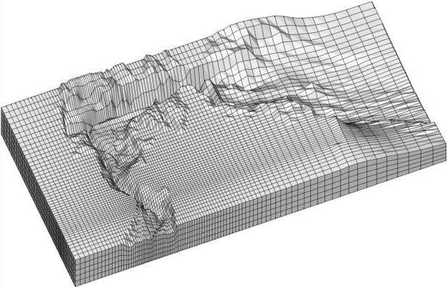
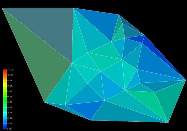
Delaunay triangulation is one of the most commonly used methods for creating TINs. By definition, 3 points form a Delaunay triangle if and only if the circle defined by them contains no other point. Focusing on creating Delaunay triangles produces triangles with fat (large) angles that have preferred rendering characteristics. The boundary edges on the Delaunay network form the convex hull, which is the smallest area convex polygon to contain all of the vertices.
Figure 0.17 Flat-Shaded Delaunay TIN of Geologic Surface
The TIN surface above (Figure 1.18) has significant variation in the size of the triangles. This is a natural consequence of the grid’s being created using only nodes from the input data file. When such a surface is rendered with data, having very large triangles can result in very objectionable visualization anomalies. These anomalies result from rendering large triangles that have a range of data values that span a significant fraction of the total data range. There are many methods that could be used to assign color to each triangle. These methods are referred to as surface rendering modes.
Two of the most commonly used rendering modes are flat shading and Gouraud shading. Flat shading assigns a single color to the entire triangle. The color is computed based on the average elevation (data value) for that triangle, lighting parameters and orientation to the viewer camera. In the upper left corner we have a large single triangle that spans a significant range of elevations. When it is assigned a color that corresponds to the mean elevation for that triangle, that color will be wrong. More precisely, the color does not fall within the color scale. Note the color of the triangle in the upper right corner of Figure 1.18 and the one below it. The color of these triangles is outside the range of our color scale.
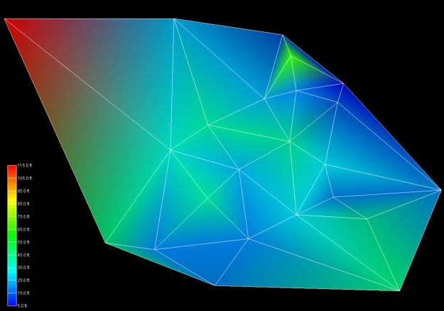
The problem of large triangles is no better when using Gouraud shading. Gouraud shading assigns colors to each node of the triangle based on the data values. This assures that the colors at the nodes (vertices of the triangles) will be correct. Colors are then interpolated over the area of the triangle based on lighting parameters and orientation to the viewer camera. Consider the triangle in the upper right hand corner of Figure 1.19. The upper right node is assigned the color blue (corresponding to a low value) and the upper left node is assigned the color red (corresponding to a high value). The color scale for this problem ranges from blue to cyan to green to yellow to red. However, for this anomalous situation the color that will be interpolated between blue and red along the uppermost edge will be magenta. Magenta is not a color in our range of colors.
Figure 0.18 Gouraud-Shaded Delaunay TIN of Geologic Surface
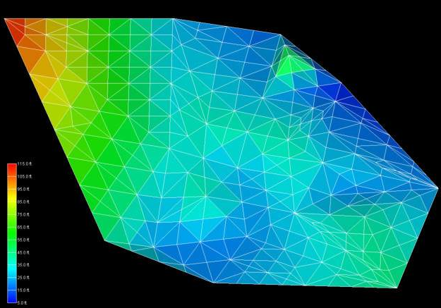
To overcome the problems caused by large triangles, the triangles can be refined (subdivided) to create a grid that still contains points that honor the original input nodes, but has more uniform cell sizes. In Figure 1.20 (which has a spatial extent of 500 feet in x and 380 feet in y) it was specified that no triangle’s edge may exceed 45 feet in length. We must interpolate the elevation values (or our data values) to these new nodes created as a result of the triangle subdivision. The simplest means of doing this is bilinear interpolation. The refined TIN grid with bilinear interpolation and flat shaded triangles is shown in Figure 1.21. Note that the all of the triangles have appropriate colors. To avoid the large cell coloring problem (this is a problem with all cell types except points), no single cell should have data values at its nodes that span more than about 20 percent of the total data range.
Figure 0.19 Flat-Shaded Subdivided TIN of Geologic Surface
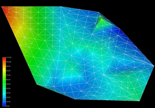
If Gouraud shading is employed instead of flat shading, the resultant surface has a smoother appearance, however the fundamental linear interpolation along cell edges is still evident in the colors. If the maximum triangle size were made much smaller, the flat shaded model would approach the appearance of the Gouraud shaded model. However, without using a different interpolation approach the Gouraud-shaded model would not change dramatically.
Figure 0.20 Gouraud-Shaded Subdivided TIN of Geologic Surface
EVS includes another technique for coloring surfaces. This method, called solid contours, assigns uniform color bands based on the data values. Figure 1.22 demonstrates this method that subdivides cells using bilinear interpolation. Because this method inherently includes triangle subdivision using bilinear interpolation, the figure would be identical whether the input grid was the large triangles from the original TIN surface or the refined smaller triangles. The boundaries of the colored bands are effectively isopachs (isolines) of constant elevation.
Figure 0.21 Solid Contour TIN of Geologic Surface
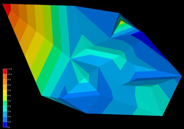
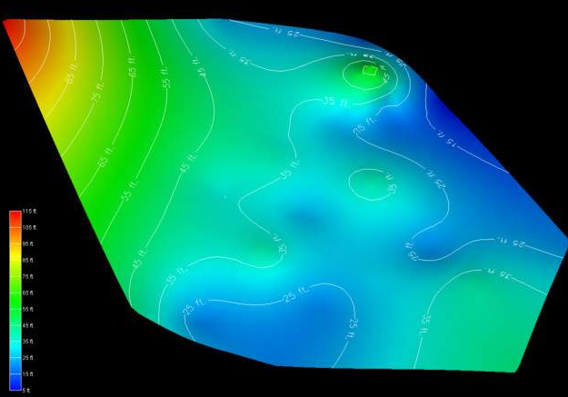
To complete this discussion and comparison of gridding and interpolation methods, the same data file was used to create a convex hull grid and the elevation data was estimated using EVS’s two-dimensional kriging software. Kriging will be discussed in more detail in section 1.3.3. This technique honors all of the original data points, but creates much smoother distributions between the values. The result shown in Figure 1.23 is a more realistic and aesthetically superior surface. Labeled isolines on 10 foot intervals were added to this figure. Note that these isolines are similar, but much smoother than those in Figure 1.22.
Figure 0.22 Kriged 2D Convex Hull Grid
Tetrahedral Irregular Networks – 3D
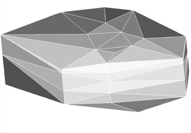
Tetrahedral Irregular Networks provide a method to create a volumetric representation of a three-dimensional set of points. As with a TIN, the nodes in the resulting grid are exclusively those in the original measured sample data. Tetrahedral Irregular Networks use tetrahedron cells to fill the three-dimensional convex hull of the data as shown in Figure 1.24. The result often contains cells of widely varying volumes having potentially large data variation across individual cells. For this and other reasons, this approach is not often used.
Figure 0.23 Tetrahedral Irregular Network
Spatial interpolation methods are used to estimate measured data to the nodes in grids that do not coincide with measured points. The spatial interpolation methods differ in their assumptions, methodologies, complexity, and deterministic or stochastic nature.
Inverse Distance Weighted
Inverse distance weighted averaging (IDWA) is a deterministic estimation method where values at grid nodes are determined by a linear combination of values at known sampled points. IDWA makes the assumption that values closer to the grid nodes are more representative of the value to be estimated than samples further away. Weights change according to the linear distance of the samples from the grid nodes. The spatial arrangement of the samples does not affect the weights. IDWA has seen extensive implementation in the mining industry due to its ease of use. IDWA has also been shown to work well with noisy data. The choice of power parameter in IDWA can significantly affect the interpolation results. As the power parameter increases, IDWA approaches the nearest neighbor interpolation method where the interpolated value simply takes on the value of the closest sample point. Optimal inverse distance weighting is a form of IDWA where the power parameter is chosen on the basis of minimum mean absolute error.
Splining
Splining is a deterministic technique to represent two-dimensional curves on three-dimensional surfaces. Splining may be thought of as the mathematical equivalent of fitting a long flexible ruler to a series of data points. Like its physical counterpart, the mathematical spline function is constrained at defined points. Splines assume smoothness of variation. Splines have the advantage of creating curves and contour lines that are visually appealing. Some of splining’s disadvantages are that no estimates of error are given and that splining may mask uncertainty present in the data. Splines are typically used for creating contour lines from dense regularly spaced data. Splining may, however, be used for interpolation of irregularly spaced data.
Natural Neighbors
Natural Neighbor interpolation is a deterministic method that estimates the value at a grid node based on a weighted average of the nearest sample points. The key to this method lies in how it determines which neighbors to use and how it calculates their weights. It uses a Voronoi diagram (or Thiessen polygons) of the sample data to identify the “natural neighbors” of a given grid node. The weights are then calculated based on the amount of area that a neighbor’s Voronoi cell “lends” to the Voronoi cell of the new grid node. This approach ensures that the interpolation is entirely local and that the influence of a sample point does not extend beyond its immediate neighbors. A significant advantage of Natural Neighbor interpolation is that it does not create artifacts or peaks where no data exists, and it smoothly handles clustered or sparse data. However, like other deterministic methods, it does not provide an estimate of prediction error.
Geostatistical Methods (Kriging)
Kriging is a stochastic technique similar to inverse distance weighted averaging in that it uses a linear combination of weights at known points to estimate the value at the grid nodes. Kriging is named after D.L. Krige, who used kriging’s underlying theory to estimate ore content. Kriging uses a variogram (a.k.a. semivariogram) which is a representation of the spatial and data differences between some or all possible “pairs” of points in the measured data set. The variogram then describes the weighting factors that will be applied for the interpolation. Unlike other estimation procedures investigated, kriging provides a measure of the error and associated confidence in the estimates. Cokriging is similar to kriging except it uses two correlated measured values. The more intensely sampled data is used to assist in predicting the less sampled data. Cokriging is most effective when the covariates are highly correlated. Both kriging and cokriging assume homogeneity of first differences. While kriging is considered the best linear unbiased spatial predictor (BLUP), there are problems of nonstationarity in real-world data sets.
The choice of surface rendering technique has a dramatic impact on model visualizations. Figure 1.25 is a dramatization that incorporates many common surface-rendering modes. These include Gouraud Shading, Flat Shading, Solid Contours, Transparency and Background Shading. In this figure, a plume is represented in each geologic layer of this model. The geologic layers are exploded and a unique rendering mode is used for each layer. This allows demonstrating five different surface rendering techniques. Section 1.2.5 included some discussion on surface rendering techniques. In the model, a very fine grid (in the x-y plane) was used and the flat shaded plume looks similar to the Gouraud shaded one. The solid contoured plume provides sharp color discontinuities at specific plume levels, however it provides no information about the variation of values within each interval.
The transparent plume was Gouraud shaded. Transparency could be applied to any of the surface rendering techniques except background shading. Transparency provides a means to see features or objects inside of the plume while still providing the basic shape of the plume. Objects inside a colored transparent object will have altered colors and the colors of the transparent object are affected by the color of the background and any other objects inside or behind the plume.
Background shading is a rather different approach. Each cell of the plume is colored the same color as the background. This makes the cell invisible, however the cell is still opaque. Objects that are behind the background shaded cells are not visible. In this example, the cell outlines are shown as lines colored by the concentration values. Background shading of the surfaces provides a “hidden line” rendering where the cells behind are not shown.
Figure 0.24 plume shell Showing Various Shading Methods
An example of the rendering mode called “no lighting” has not been included in this paper. This technique renders cells as a single color (similar to flat shading), but with no lighting or shading effects. This eliminates all three-dimensional clues about the surface and usually produces an undesirable affect.
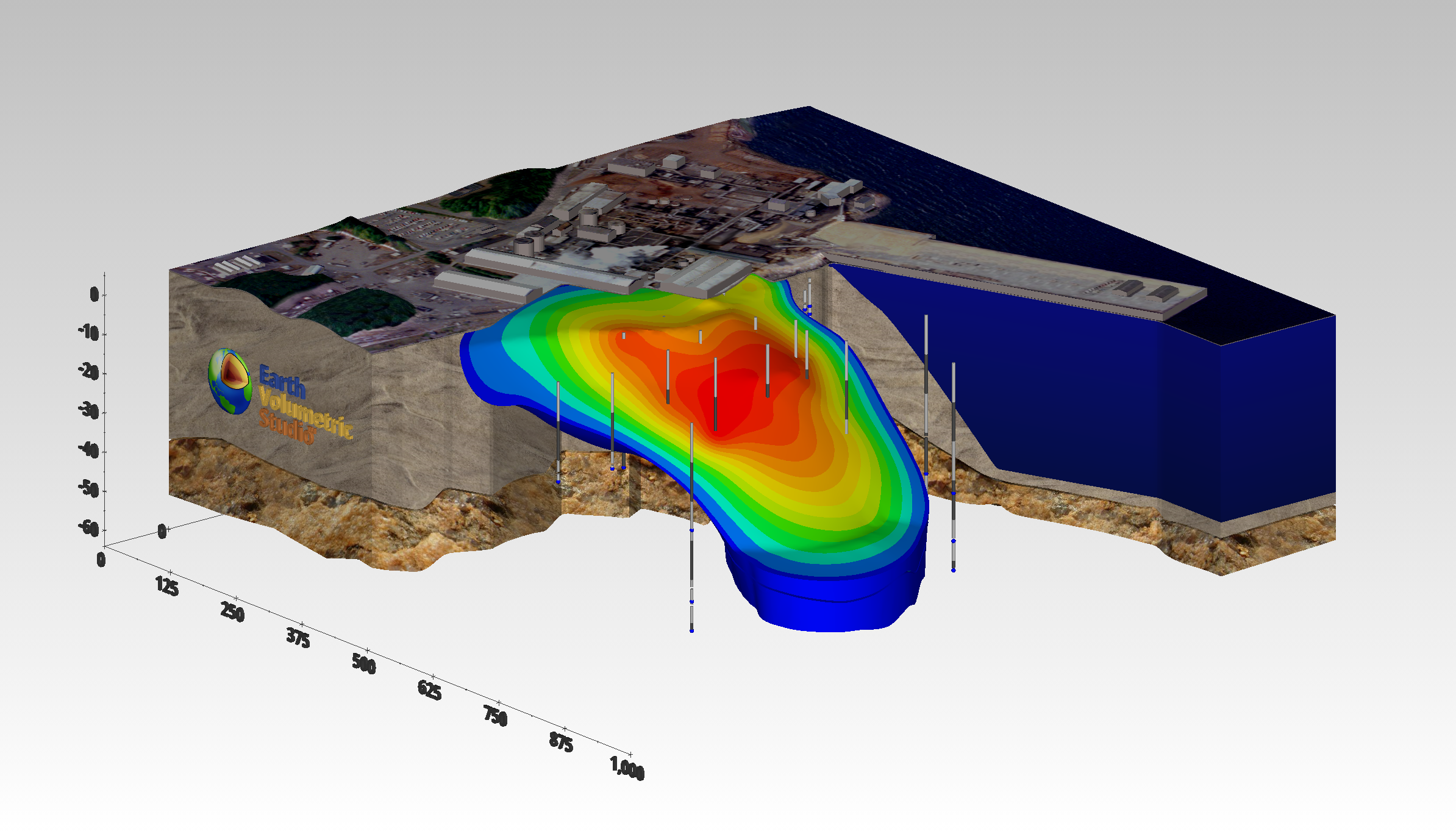
Texture mapping is a process of projecting a raster image onto one or more surfaces. The images should be geo-referenced (see section 1.1.1.5) to ensure that the image’s features are placed in the correct spatial location. In Figure 1.26, a chlorinated hydrocarbon contaminant plume is shown at an industrial facility on the coast. Sand and rock geologic layers are displayed below the ocean layer. A color aerial photograph of the actual site was used to texture map and render the geologic layer that represents the ocean and was also applied to the three-dimensional representations of the site buildings as well as the ground surface.
The choice of color(s) to be used in a visualization affects the scientific utility of the visualization and has a large psychological impact on the audience. Throughout this paper, a consistent color scale (a.k.a. datamap) has been used. This color scale associates low data values with the color blue and high data values with the color red. Values between the data minimum and maximum are mapped to hues that transition from red to yellow to green to cyan (light blue) to blue. People are accustomed to interpreting blue as a “cold” color and red as a “hot” color. For this reason, lay persons more easily understand this color spectrum. It also provides a reasonably high degree of color fidelity, allowing discrimination of small changes in data values.
However, many times color scales with vivid colors like red are deemed too alarming. Since there is not a universally (or even scientifically) accepted standard for color spectrums used for data presentation, the use of softer shades of color and the elimination of red or other garish colors from the spectrum cannot be challenged on a scientific or legal basis. The consequence of this is the distinct possibility of two different visualizations that both communicate the same information with completely different colors. Often the choice of colors is made on aesthetic or political grounds, governed more by the party being represented and their role in the site than by scientific reasons.
The following provides hints and tips for obtaining optimal quality when printing. This assumes you are using a color printer, but it is important to note that the user may print grayscale images with a black and white printer if desired. This would of course be best implemented by creating grayscale colormaps to eliminate ambiguities associated with different colors that have the same gray-scale representation.
Optimal printing of a raster image requires taking several factors into consideration. First, you must know the characteristics of the printer and the intended size of the printed image. Printers vary considerably and no single recommendation can be appropriate. Color printers fall into three primary categories, inkjet, color laser, and dye sublimation. EVS, for example, produces raster images which are continuous tones with 256 shades each of red, green and blue for a total of 16.7 million possible colors (256 * 256 * 256). Color printers either produce continuous tones or approximate them using a pattern of primary colored pixels in an n-by-n grid.
Among these three printer categories there is considerable variation. Inkjet printers are generally capable of producing one of only eight primary colors for each printer pixel (or dot). These colors are white, black, cyan, magenta, yellow, red, green and blue. Inkjets must therefore use a grid of primary colored pixels to approximate continuous tones. The larger the grid (4 by 4 vs. 2 by 2) the better the color approximation. However, larger grids tend to create artifacts called jaggies that are visually undesirable. The challenge is to balance the need for smoother color rendition with the desire to have higher resolutions.
Dye sublimation printers are at the other end of the spectrum. Their ability to reproduce continuous tones makes the task of choosing a resolution easy. A typical dye-sub printer has a resolution of 300 dots per inch (dpi). If the intended size of the final printed image is 10 inches wide by 7 inches tall, then the optimal image size is 10*300 by 7*300 or 3000 x 2100 pixels. If quicker image creation and print times are desired, a compromise resolution would be exactly half or 1500 wide by 1050 high.
It is best to have an integer number of printer pixels for each “source” image pixel. When the image size is half of the printer pixel resolution, each source pixel gets a 2-by-2 grid. The n-by-n grid concept applies to all types of printers. This “rule” is actually a guideline for best results. Other resolutions (non-integer ratios) create banding artifacts that are usually objectionable.
For inkjet printers you should always allow for at least a 2x2 grid and usually 3x3 to 5x5 gives the best results. For an EPSON printer with 720x1440-dpi resolution you should use the smaller resolution number (720) for your calculations. The printer uses the additional resolution to better approximate the colors.
Example: For a printer with 720 dpi, to print an image 9 by 7.5 inches (landscape) we recommend that you start at a 4x4 grid which gives an effective printed resolution of 180 dpi. Your image width and height would therefore be:
Width = 9.0 * 180 = 9.0 * (720/4) = 1620
Height = 7.5 * 180 = 9.5 * (720/4) = 1350
Finally, color laser printers vary in their abilities to approximate continuous tones. This means that the rules to apply will be somewhere between dye-sub and inkjet properties.
Once the model of the site has been created, visually communicating the information about that site generally requires subsetting the model. Subsetting is a generic term used to convey the process of displaying only a portion of the information based on some criteria. The criteria could be “display all portions of the model with a y coordinate of 12,700. This would result in a slice at y = 12,700 through the model orthogonal to the y (or North) axis. As this slice passes through geologic layers and/or contaminated volumes, a cross-section of those objects would be visible on the slice. Without subsetting, only the exterior faces of the model will be visible.
When evaluating subsetting operations, the dimensionality of input and output should be considered. As an example, consider the slice described above. If a slice is passed through a volume, the output is a 2D planar surface. If that same slice passes through a surface, the result is a line. Slices reduce the dimensionality of the input by one. The sections below will discuss a few of the more common subsetting techniques.
Plume Visualization
Contaminant plume visualization employs one of the most frequently used subsetting operations. This is accomplished by taking the subset of all regions of a model where data values are above or below a threshold. This subset is also referred to as a volumetric subset and its threshold value as the subsetting level. When creating the objects that represent the plumes, two fundamentally different approaches can be employed. One approach creates one or more surfaces corresponding to all regions in the volume with data values exactly equal to the subsetting level and all portions of the external surfaces of the model where the data values exceed the subsetting level. This results in a closed but hollow representation of the plume. This method, which was used in Figure 1.26, has a dimensionality one less than the input dimensionality.
The other approach subsets the volumetric grid outputting all regions of the model (cells or portions thereof) that exceed the subsetting level. This method has the same dimensionality output as input. The disadvantages of this approach are the need to compute and deal with the all interior volumetric cells and nodes. The advantages include the ability to perform additional subsetting and to compute volumetric or mass calculations on the subset volume.
Cutting and Slicing
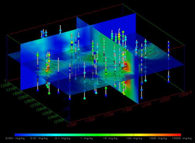
Within C Tech’s EVS software there is a significant distinction between the terms cut and slice. Slices create objects with dimensionality one less than the input dimensionality. If a volume is sliced the result is a plane. If a surface is sliced the result is one or more lines. If a line is sliced, one or more points are created. Figure 1.29 has three slice planes passing through a volume which has total hydrocarbon concentrations on a fine 3D grid. The horizontal slice plane is transparent and has isolines on ½ decade intervals.
Figure 0.28 Three Slice Planes Passing Through a 3D Kriged Model
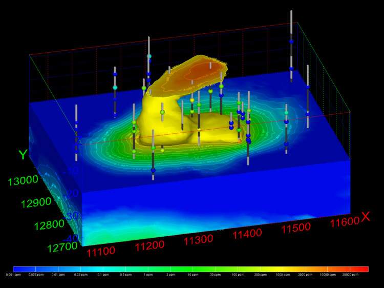
By comparison, cutting still uses a plane, but the dimensionality of input and output are the same. Cutting outputs all portions of the objects on one side of the cutting plane. If a volume is cut, a smaller volume is output. In Figure 1.30, the top half of the grid was cut away, but the plume at 1000 ppm is displayed in this portion of the volume. The lower half of the model also has labeled isolines on ½ decade intervals.
Figure 0.29 Cut 3D Kriged Model with Plume and Labeled Isolines
Isolines
Isolines (sometimes referred to as isopachs) have output dimensionalities that are one less than the input dimensionality. Surfaces with data result in isolines or contour lines that are paths of constant value on the surface(s). Isolines can be labeled or unlabeled. Various labeling techniques can be employed ranging from values placed beside the lines to labels that are incorporated into a break in the line path and mapped to the three-dimensional contours of the underlying surface. Examples of visualizations using isolines are shown in Figures 1.30 and 1.26.